
2023-03-14
Emma Fitzgerald
Design Dispatch, New York
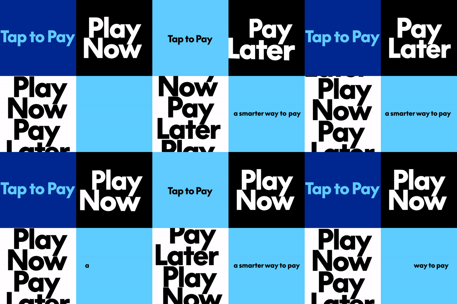
Pentagram's recent design for PayPal's rebrand incorporates fluid, gestural elements to create a seamless user experience. The updated brand identity aims to simplify and streamline the payment process through intuitive visual cues.
PayPal Embarks on New Chapter with Modernized Brand Identity
In an effort to revitalize its image and resonate with a new generation of users, PayPal, a financial technology giant with over 25 years of experience, has unveiled a fresh brand identity. The revamped visual language is designed by Pentagram partner Andrea Trabucco-Campos and her team, who aimed to distill the essence of online payment into a cohesive and engaging narrative.
At the heart of this rebranding effort lies a new motion language that seeks to capture the intuitive and seamless nature of PayPal's services. The fresh aesthetic celebrates everyday user actions such as "tapping, flipping, and swiping," effectively embodying the simplicity and fluidity that define modern online payment experiences. This approach enables users to directly relate with the brand on a more personal level, fostering a deeper connection with the platform.
The new brand identity not only injects a sense of dynamism into PayPal's visual language but also serves as a powerful tool for communicating the company's values and mission. By embracing motion elements that evoke user-centric interactions, the rebranded identity conveys a clear understanding of the needs and behaviors of its target audience. This empathetic approach allows PayPal to differentiate itself from competitors and establish a unique position in the financial technology space.
The success of this rebranding initiative can be attributed, in part, to the meticulous attention paid to detail by Andrea Trabucco-Campos and her team at Pentagram. The carefully crafted brand identity is designed to promote a sense of fluidity and continuity, effectively bridging the gap between PayPal's rich history and its bright future. By staying attuned to user needs and leveraging the latest design trends, the revamped identity positions PayPal as a forward-thinking leader in the rapidly evolving world of financial technology.
The rebranding effort also underscores the significance of motion graphics in contemporary brand storytelling. As digital platforms continue to shape our daily experiences, the strategic use of motion elements becomes increasingly vital for capturing attention and conveying complex messages. In this context, PayPal's new brand identity serves as a compelling case study for the power of motion language in creating engaging narratives that resonate with diverse audiences.
Furthermore, this rebranding effort is a testament to the enduring value of human-centered design principles. By focusing on user experiences and everyday interactions, PayPal has successfully distanced itself from the complexities often associated with financial technology. This empathetic approach not only fosters a deeper connection between the brand and its users but also reinforces PayPal's commitment to creating intuitive and seamless payment experiences that benefit all.
Ultimately, the modernized brand identity of PayPal represents a pivotal moment in the company's evolution as it seeks to reinvigorate itself for the challenges ahead. By embracing motion language and human-centered design principles, PayPal is poised to stay relevant and competitive in an industry characterized by rapid innovation and shifting user behaviors. As this pioneering financial technology company embarks on its next chapter, it will be fascinating to observe how this new brand identity continues to shape the narrative of digital payments and inspire users around the world.
PayPal's New Brand Identity: Key Takeaways
The Future of Financial Technology: Implications of PayPal's Rebranding
PayPal's rebranding effort serves as a powerful reminder of the evolving nature of financial technology. As digital platforms continue to shape our daily experiences, companies must adapt to stay relevant and competitive in an industry characterized by rapid innovation and shifting user behaviors. The modernized brand identity of PayPal offers valuable insights into the importance of human-centered design principles and motion language in creating engaging narratives that resonate with diverse audiences.
By embracing these design trends and principles, other financial technology companies can learn from PayPal's success and position themselves for a brighter future in this rapidly evolving space. As we look ahead to the challenges and opportunities that lie ahead, it will be intriguing to observe how this rebranded identity continues to shape the narrative of digital payments and inspire users around the world.
Conclusion
PayPal's rebranding effort is a compelling case study for the power of motion language in creating engaging narratives that resonate with diverse audiences. By embracing human-centered design principles and motion elements, PayPal has successfully distilled the essence of online payment into a cohesive and engaging visual identity. As financial technology continues to evolve, this rebranded identity serves as a powerful reminder of the importance of adapting to changing user behaviors and staying attuned to the needs of our increasingly digital lives.