Design DispatchDesign Dispatch
  • All articles
  • Fine Arts
  • Brand Identity
  • Graphic Design
  • Fashion
  • About
  • Media pack
  • Terms and conditions
Design DispatchDesign Dispatch

Categories

Fine ArtsBrand IdentityGraphic DesignFashionMusic

Editorial team

Michael ReyesDaniel HartmanEric CallowaySarah ChenEmma FitzgeraldLauren Rodriguez

Company

AboutTerms and conditionsPrivacy policy

© 2026 Design Dispatch

Privacy policyTerms and conditionsCookie policy

The Nomadic Eye

2026-01-21

Emma Fitzgerald

Design Dispatch, New York
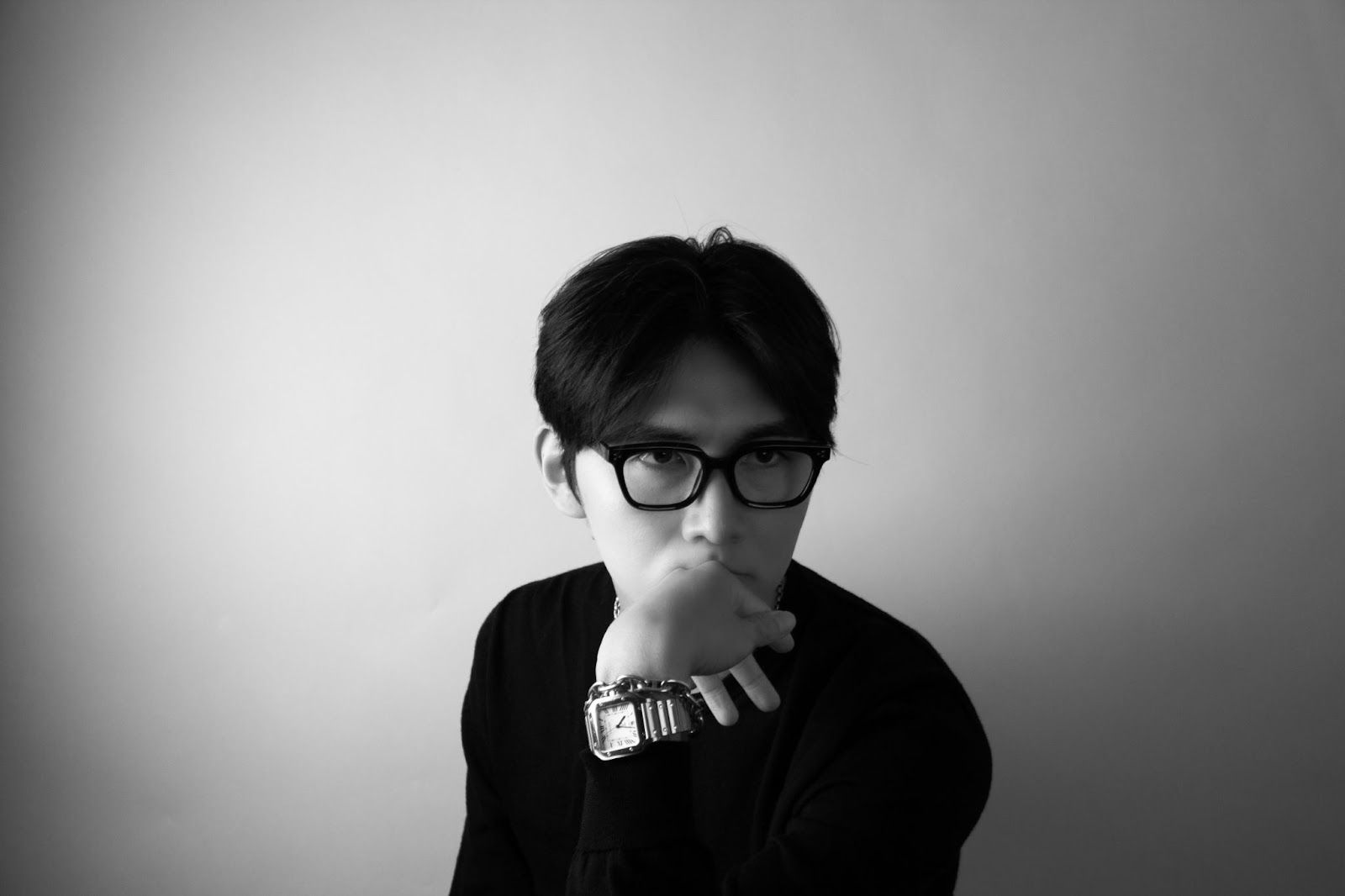
Daeyun Kim on how movement across disciplines shaped a new way of seeing

For Daeyun Kim, creativity has never belonged to one place. His story moves between worlds—fashion, fine art, graphic design, and advertising—each leaving a trace on how he sees. That constant motion, rather than any single discipline, became his foundation.
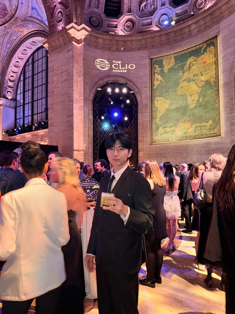
Image ID: kix.ag8xj1fnop3h

In 2025, Kim emerged as one of the most awarded young art directors in the world, winning across the industry’s Big Five—Clio, D&AD, One Show, New York Festival, and the ANDY Awards. But his work feels less like a pursuit of accolades and more like an exploration of perspective— the kind you find only by moving.

Fashion as the first language

Kim left high school early and launched his own fashion boutique in Seoul. That store became his first studio, his first experiment in how visuals affect emotion. “Fashion taught me instinct,” he says. “People react to proportion and touch, but behind that, they respond to feeling.” It was here he realized that creativity could extend far beyond fabric. He wasn’t just designing clothes—he was learning how people connect to meaning.
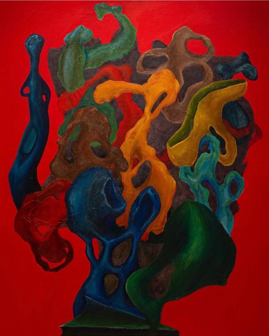
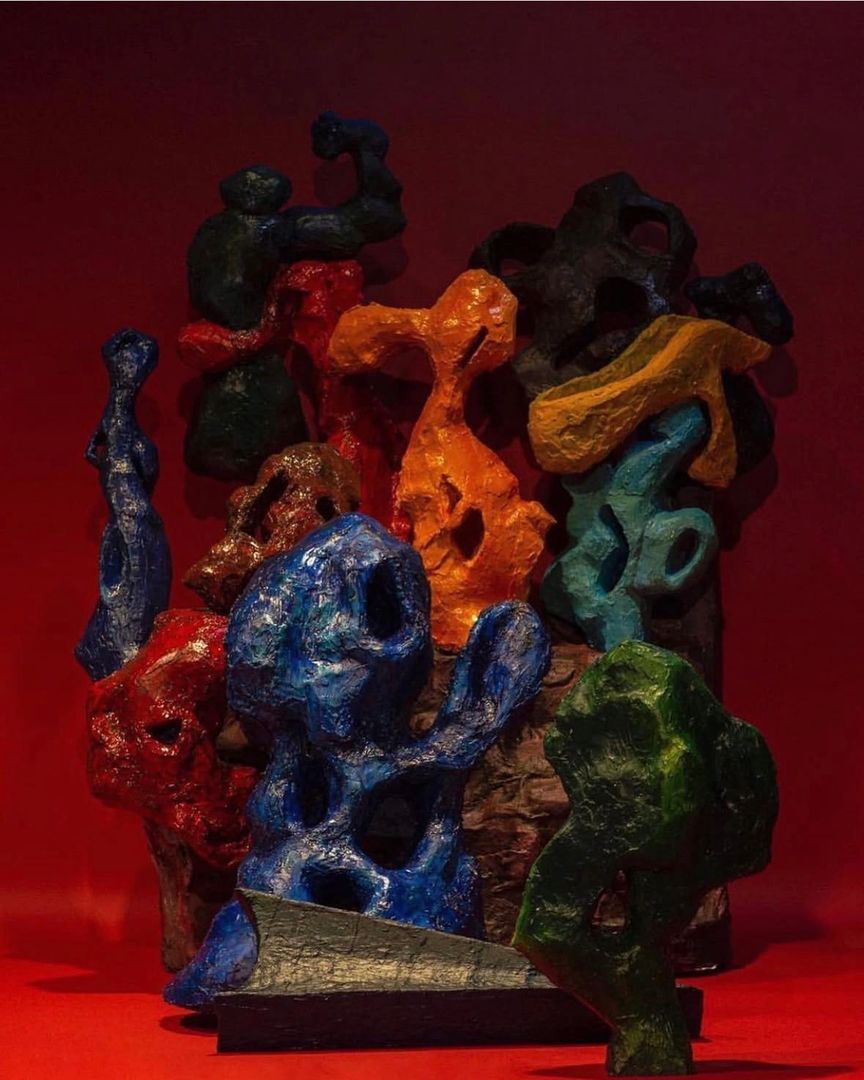
Image ID: kix.vosqnlptj252Image ID: kix.j32b2nkpdomx

From surface to depth

After fashion came fine art, a space for reflection. Through painting and material studies, Kim began to examine why certain images stay with us. “Art made me slow down,” he says. “It turned creation into observation.” Then came graphic design, where structure and clarity grounded that introspection. “Design taught me logic. Every line had to speak for something.” Together, these stages built what he calls a “layered vision”—instinct, reflection, and structure working in harmony.
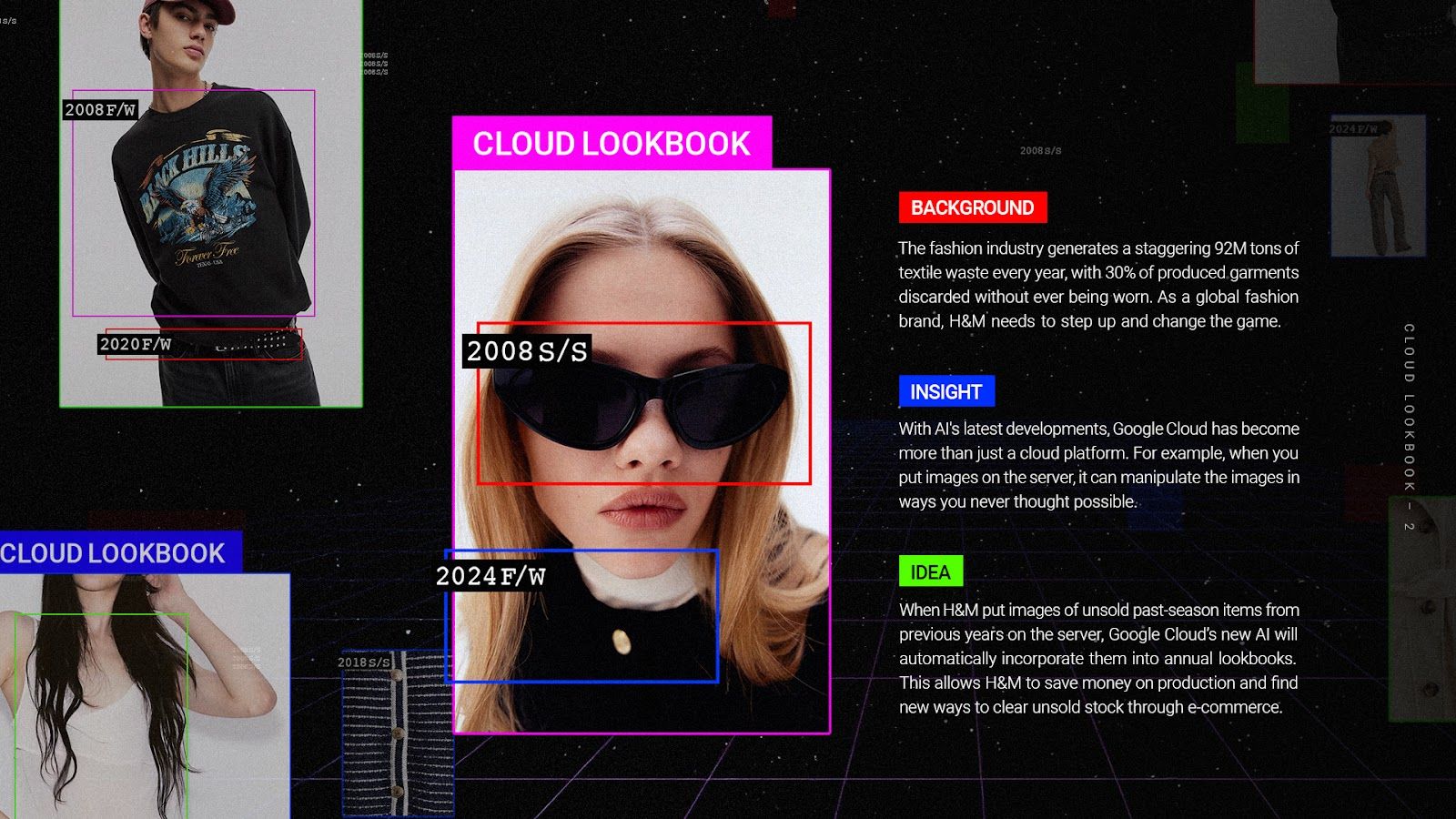
Image ID: kix.utv7iu5umv5e

Advertising as human language

Advertising became the place where all those languages met. To Kim, it’s not about selling but about translating human emotion into visual form. His recent campaigns—Starbucks – Unseen Stars, Vaseline – Blue Shield, Heinz – Super Bowl Leftover Recipe, and Google Cloud – Cloud LookBook— each explored a different emotion: recognition, protection, humor, and balance. “The Google Cloud project was about treating technology as invisible art,” he explains. “It asked how data could feel—how something digital could move people.”

Image ID: kix.gctwhq8d757i

Leading without a title

At Wieden+Kennedy, Kim worked as a junior art director but refused to let hierarchy define his role. He led creative development across teams and even helped secure new business through his conceptual direction. “At W+K, ideas didn’t belong to anyone,” he says. “The best thought always won. It taught me that clarity is more powerful than position.” That experience solidified his belief that creativity is a collective act— an ecosystem where freedom and trust make ideas stronger.

Movement as method

Kim describes his creative practice as nomadic by nature. Each transition—from one field to another, from one city to the next—has expanded how he thinks visually. “I don’t see movement as change,” he says. “It’s accumulation.” To him, awards are only markers along a longer journey. “What matters is that someone feels something.That’s how I know a piece worked—it travels.”

Closing Thought

From Seoul’s fashion district to a New York studio, Daeyun Kim’s vision has been shaped by motion, not by belonging. Every phase—fashion’s instinct, art’s introspection, design’s structure, advertising’s empathy— forms part of what he calls a living language of creativity.“Movement keeps me honest,” he says. “It keeps me curious. Every new place teaches me to see again.”

More Similar Articles

thumbnail for article titled The Nomadic Eye

The Nomadic Eye

Daeyun Kim on how movement across disciplines shaped a new way of seeing For Daeyun Kim, crea

Recently published

More like this

thumbnail for article titled Meticulous Pixelation Inspired by Norwegian Embroidery Techniques

Meticulous Pixelation Inspired by Norwegian Embroidery Techniques

Norwegian embroidery has been an integral part of the country's cultural heritage for centuries, with intricate patterns and designs adorning textiles like woolen fabrics and linens. Agathe Millet's pixel font interpretation pays homage to this artisanal tradition while reimagining it in a digital format.

thumbnail for article titled Xu Han Is Elevating Healthcare Advertising Through Surrealist Vision and AI Innovation

Xu Han Is Elevating Healthcare Advertising Through Surrealist Vision and AI Innovation

Healthcare advertising has traditionally relied on clinical imagery, cautious messaging, and functio

thumbnail for article titled Taiwan's Scenic Inspiration Drives Artist Yi Hua Lin's Visceral Posters

Taiwan's Scenic Inspiration Drives Artist Yi Hua Lin's Visceral Posters

Taiwanese artist Yi Hua Lin creates stunning graphic posters that capture the essence of his homeland's breathtaking natural landscapes. His artwork seamlessly blends traditional Taiwanese motifs with modern design elements, resulting in visually striking pieces that evoke a sense of cultural identity and connection to the environment.

thumbnail for article titled Other Box Unveils New Identity as Champion of Equality Everywhere

Other Box Unveils New Identity as Champion of Equality Everywhere

Other Box has announced its name change to Omse, as it continues to strive for inclusivity and diversity in all aspects of life. By embracing this new identity, Omse aims to further amplify its mission and reach a wider audience.

thumbnail for article titled PayPal Rebranded as Pentagram

PayPal Rebranded as Pentagram

Pentagram's recent design for PayPal's rebrand incorporates fluid, gestural elements to create a seamless user experience. The updated brand identity aims to simplify and streamline the payment process through intuitive visual cues.

thumbnail for article titled The End of an Era as We Studio Redesigns Final Print Issue of Office Magazine

The End of an Era as We Studio Redesigns Final Print Issue of Office Magazine

Microsoft's We Studio has launched a major revamp of its Office platform, signaling the end of traditional print publication for the iconic title. The digital-only format will cater to a changing reader landscape and provide access to content across various devices.

thumbnail for article titled When the State Becomes a Stage: Rasim Bayramov's Architecture of Deferral

When the State Becomes a Stage: Rasim Bayramov's Architecture of Deferral

*At ICA VCU, an artist transforms the cold machinery of state administration into a meditation on hu