
2026-02-12
Daniel Hartman
Design Dispatch, New York
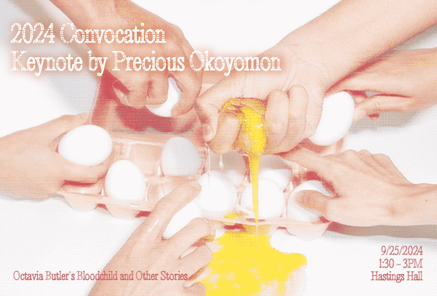
In a digital landscape dominated by sharp edges, bright screens, and constant motion, Aylin Alakbarli’s work is a quiet rebellion. Her design and animation practice centers on softness, texture, and color as more than aesthetic choices. They are tools of feeling, memory, and emotional connection.
Alakbarli’s path to design is unconventional. Before pursuing her MFA at Yale, she earned a BSc in Geophysical Engineering from the French-Azerbaijani University, spending time in the field, working in labs, and engaging with complex hardware systems. This foundation gave her a deep understanding of structure, systems, and translating technical complexity into digestible forms. Today, that ability to take hard, abstract information and render it visually accessible, and emotionally resonant, is central to her practice.
Across her projects, Alakbarli demonstrates how design can be more than functional; it can be intimate, poetic, and human.
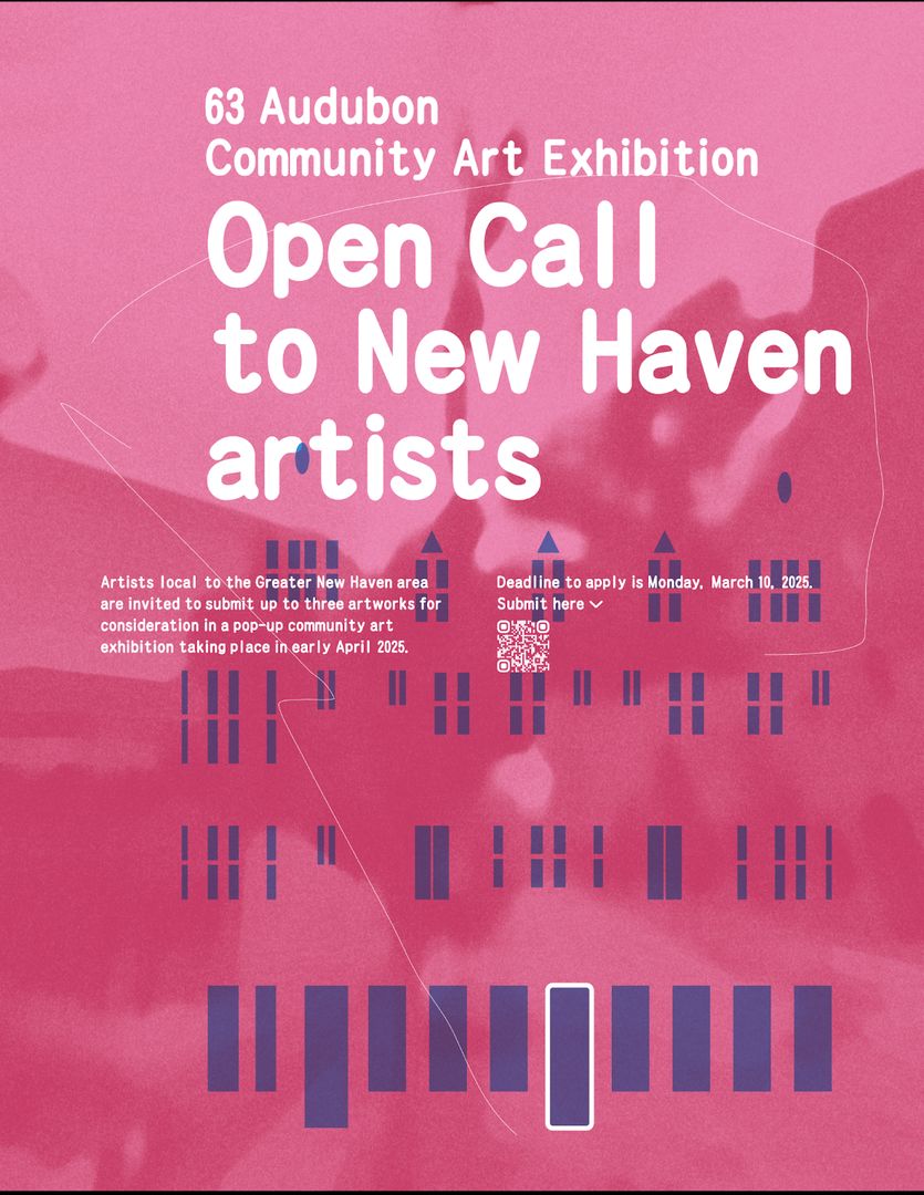
For Alakbarli, color is never neutral. It is the first language a viewer encounters, shaping perception and evoking subtle emotional responses. Warm pastels, muted earth tones, and layered hues form palettes that feel lived-in, almost tactile.
“I think of color the way I think of memory,” Alakbarli explains. “Memories aren’t perfectly saturated or high-contrast. They’re layered, slightly blurred, sometimes warm, sometimes heavy.”
Her approach is intuitive, guided by feeling rather than trends. Calm, curiosity, and trust are all encoded in the choices she makes. Even in fast-moving digital environments, her colors slow down the experience, encouraging the viewer to pause and absorb.
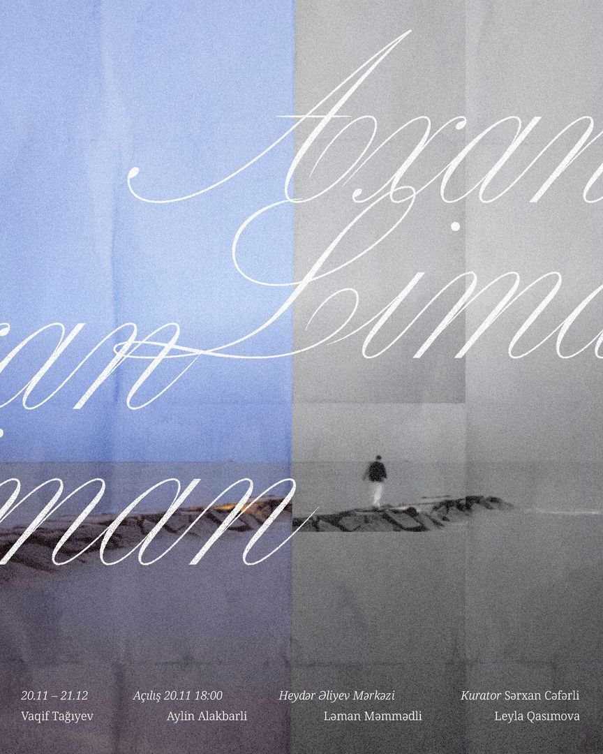
Texture is equally central to Alakbarli’s visual language. In a world increasingly dominated by flat surfaces and frictionless interfaces, she reintroduces the sense of touch visually. Grain, softness, and subtle material references, such as textiles, paper, even skin, invite viewers to imagine weight, warmth, and resistance.
“Texture is how I bring the body back into digital space,” she explains. “Even if you can’t physically touch something, your eyes remember what touch feels like.”
Her textures are never ornamental; they are structural. They add depth, hierarchy, and rhythm, shaping how an image is read and felt. In animation, texture slows movement and adds atmosphere; in static design, it creates a sense of presence and weight.

One of the defining qualities of Alakbarli’s work is its softness. In a culture that equates authority with sharpness, her work challenges that norm. Softness, for her, is deliberate, precise, and expressive.
“Softness can hold complexity. It can be intentional. It can be powerful,” she explains.
By prioritizing softness, Alakbarli designs spaces and visuals that are welcoming and emotionally resonant. Her work provides a respite from overstimulation, offering audiences a moment of calm reflection.
Alakbarli’s design sensibility is deeply informed by her engineering background. Her experience with fields, labs, and system-based problem-solving taught her how to take raw, complex data and turn it into something understandable. Today, she brings that same methodology to digital design, translating challenging ideas into visuals that feel accessible, intuitive, and human.
Whether designing an interface, animation, or static imagery, she ensures that color, texture, and softness coexist with clarity and function. Emotional resonance and usability are not opposites, they are inseparable in her practice. “If something feels good, you’re more likely to trust it. More likely to stay with it.” she notes.
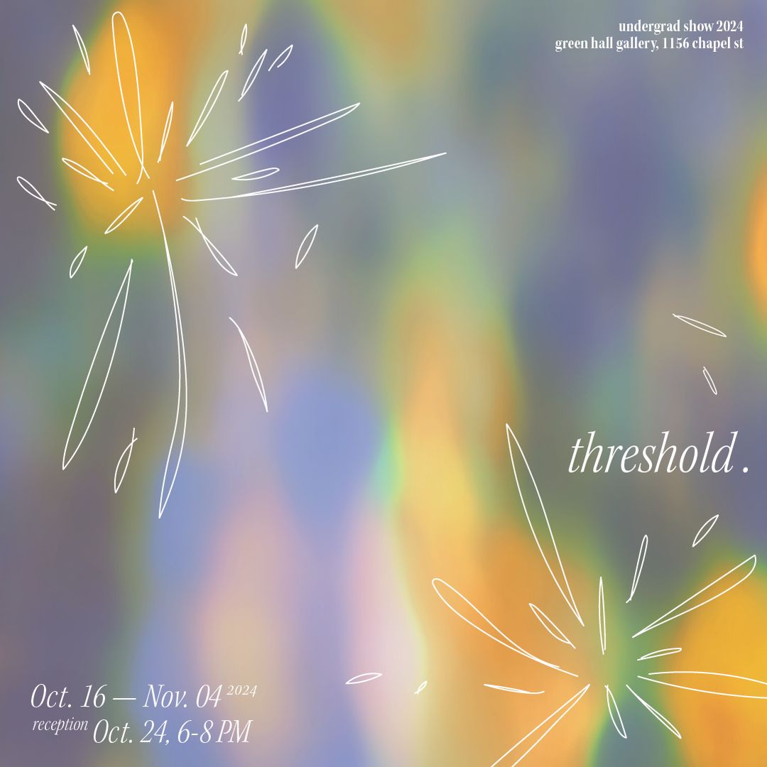
Aylin Alakbarli’s design philosophy is more than style; it is a proposition. That design can be felt, that screens can hold warmth, and that digital experiences can be poetic. Her work invites viewers to slow down, engage, and feel seen in spaces often designed to rush them past content.
Through color, texture, and softness, Alakbarli is shaping a visual language that is human first, functional second. In a world racing toward speed, her work is a reminder: design can—and should be a space for presence, emotion, and connection.