WINNER WINNER WINNER WINNER WINNER WINNER WINNER

Spring 2026 - WINNER
Drawn to Nature - SS26
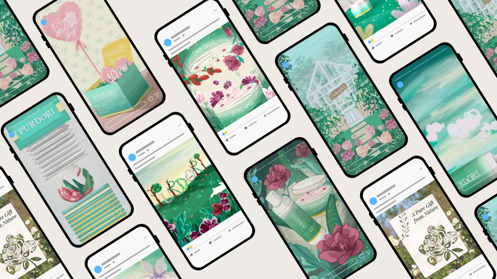
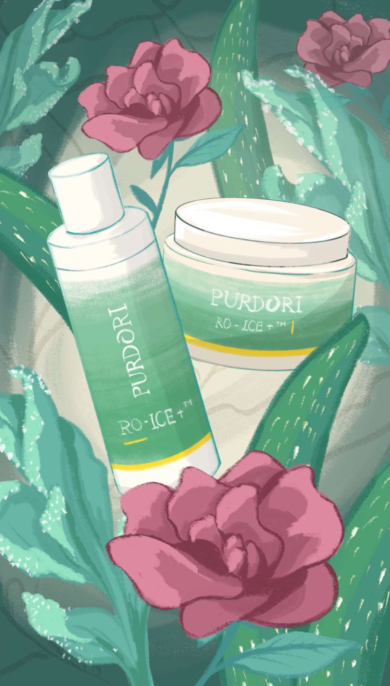
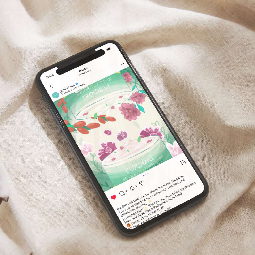
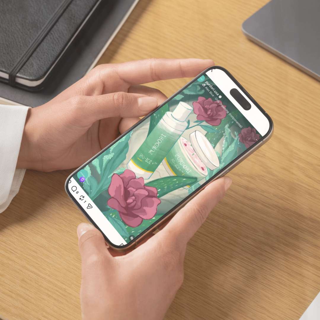
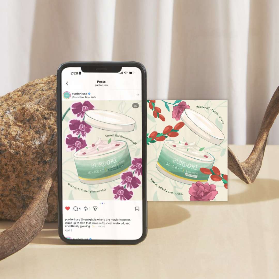
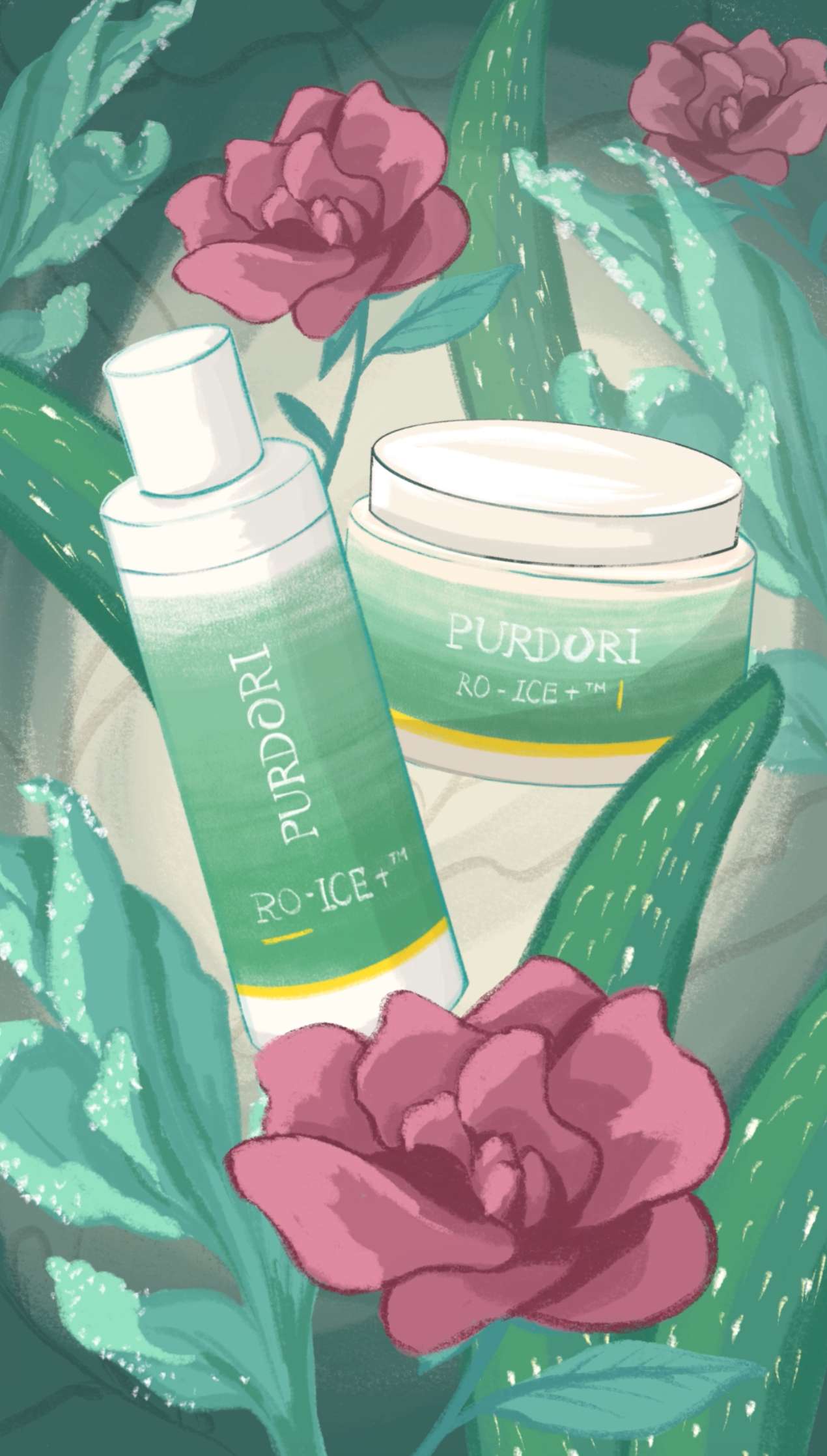
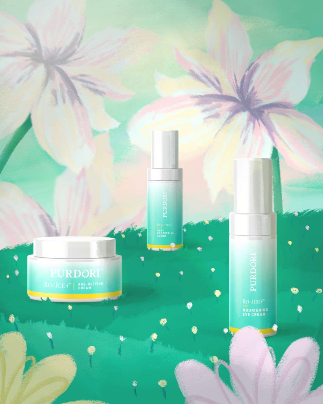
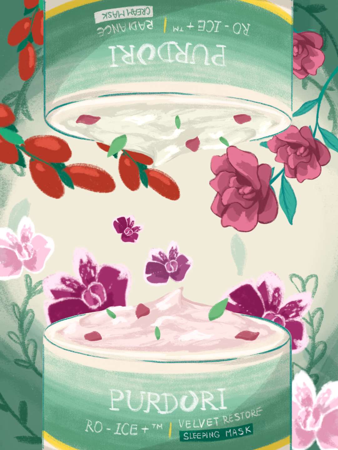
This campaign is designed for the luxury skincare brand, Purdori, using hand-drawn Procreate illustration and animation to make its plant-based, science-backed products feel approachable, human, and true to its sustainability values. In an industry that built on sterile imagery and unattainable perfection, I made a different choice. I drew by hand. The campaign is built around one core idea: replacing the cold, clinical look of luxury skincare with something warmer and more personal. While most brands lean into a polished, lab-like aesthetic, I turned to Procreate and my Apple Pencil. In a world where everything online looks digitally perfect, hand-drawn illustration feels refreshingly real. I believe it will slow people down and invite them in. Purdori's products are built on a key principle: replacing water with a rich blend of botanical extracts. I wanted the visuals to reflect that same closeness to nature. Rather than cold diagrams or technical charts, I illustrated these ingredients and processes by hand, bringing them to life through line, movement, and texture. Concepts like Exosomes and Stem Cells, which can feel distant or overly scientific, become approachable stories when drawn rather than explained. For me, the medium and the message had to match. My illustrations focus on leaves, roots, and botanicals, not as background decoration but as the main event. Each one is a quiet reminder that what makes these products effective comes from nature, not a factory. Choosing a softer, more considered visual style over flashy luxury tropes was itself a statement about what the brand stands for. These assets are designed to live on Meta ads and social media. In feeds crowded with AI-generated imagery and over-produced content, a hand-drawn line stands out. Not because it shouts, but because it feels made by a person. That sense of craft is hard to fake and easy to remember.
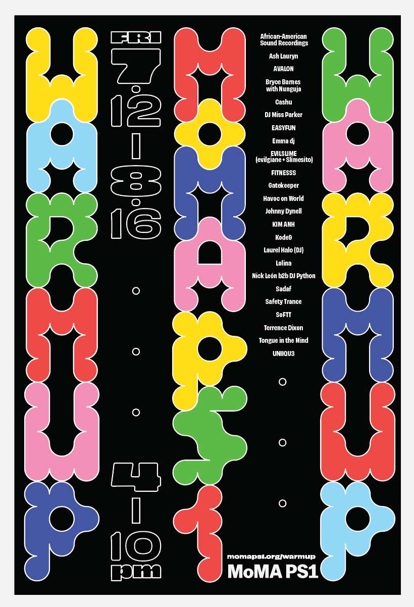
MoMA PS1 Warm Up Festival Rebranding
.png?alt=media&token=23d27bc8-fe00-44ec-99e4-2a409d860c3d)