SHORTLISTED
Spring 2026 - SHORTLISTED
SANVO Fine Chemicals Advertising Photography Campaign
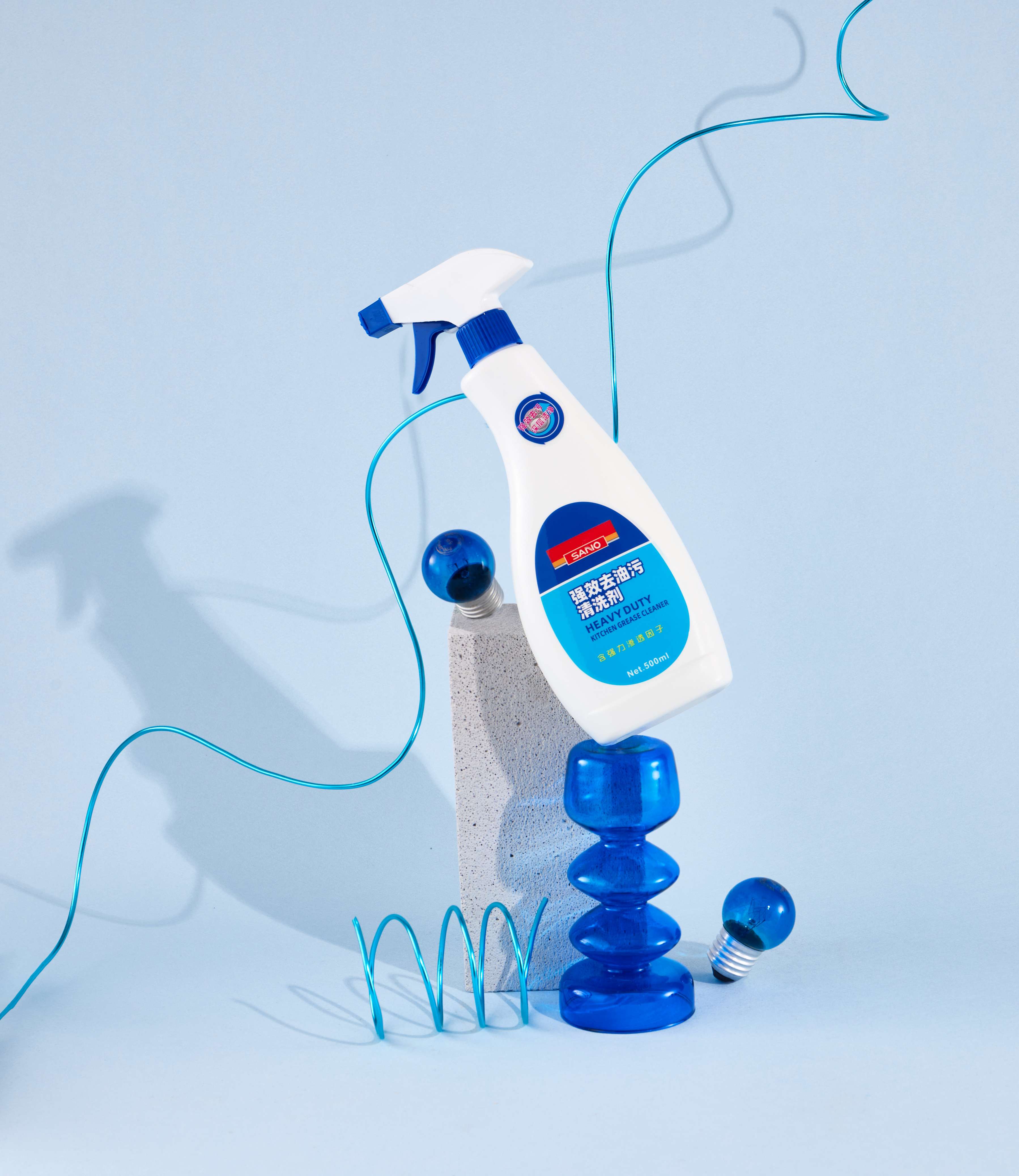
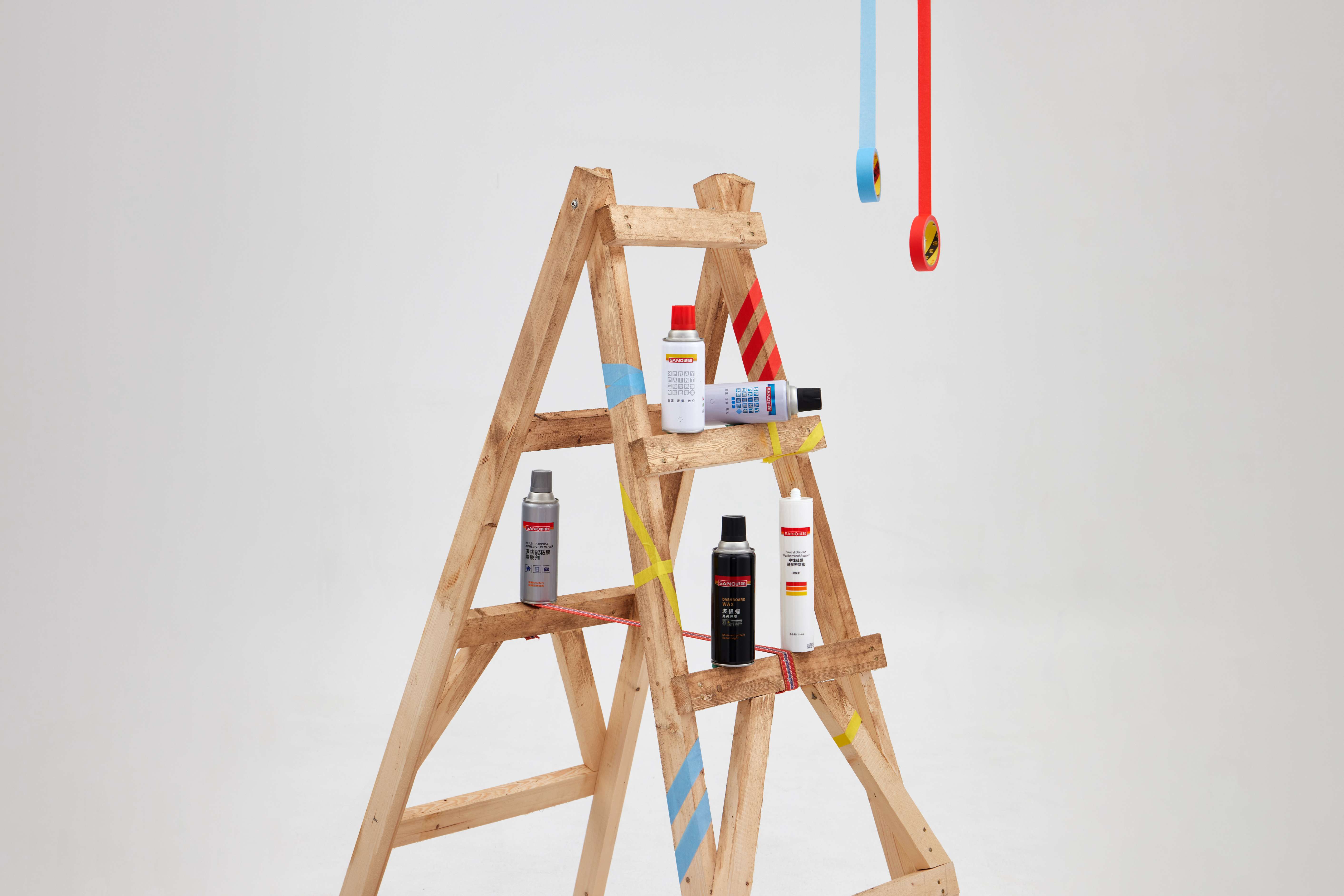
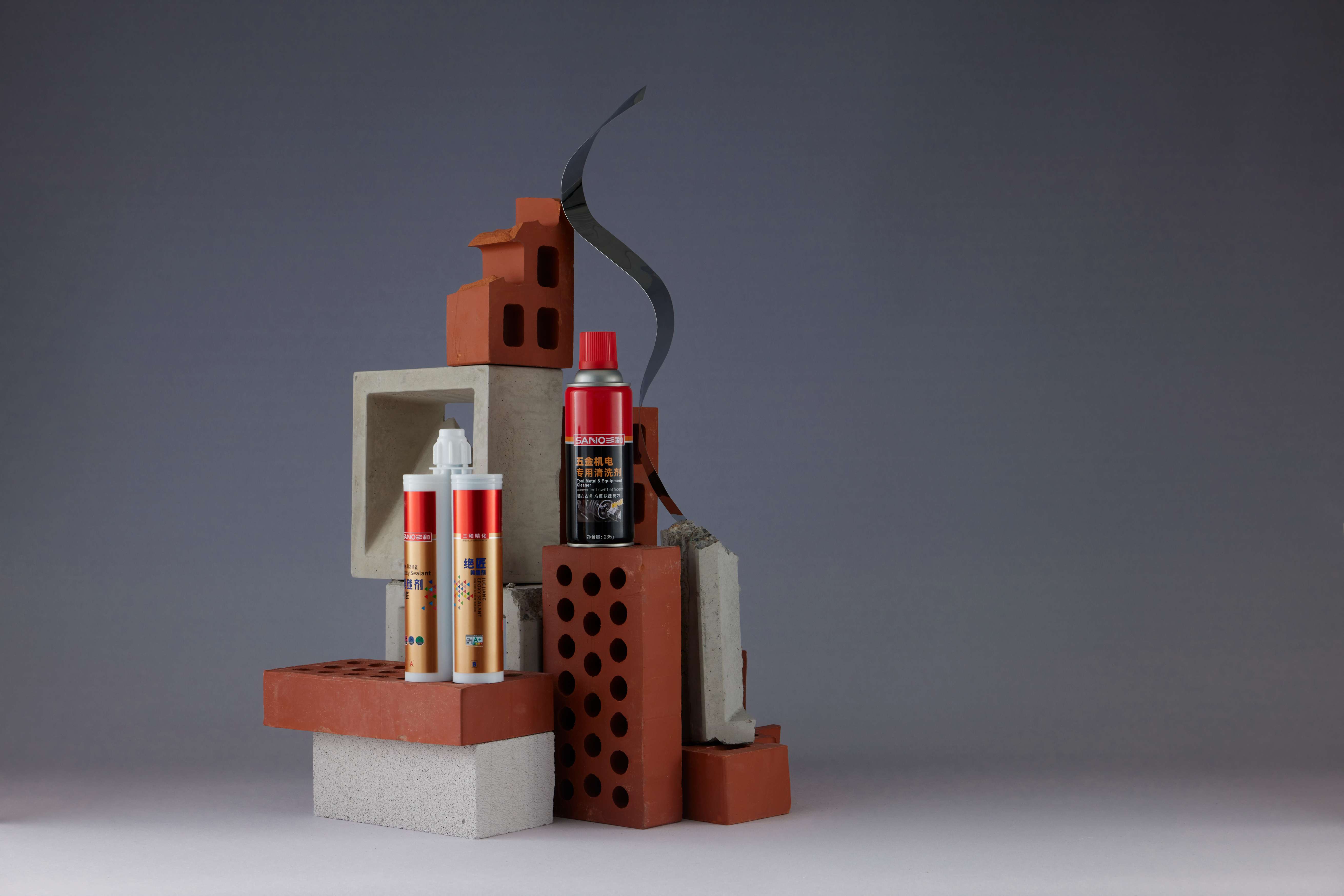
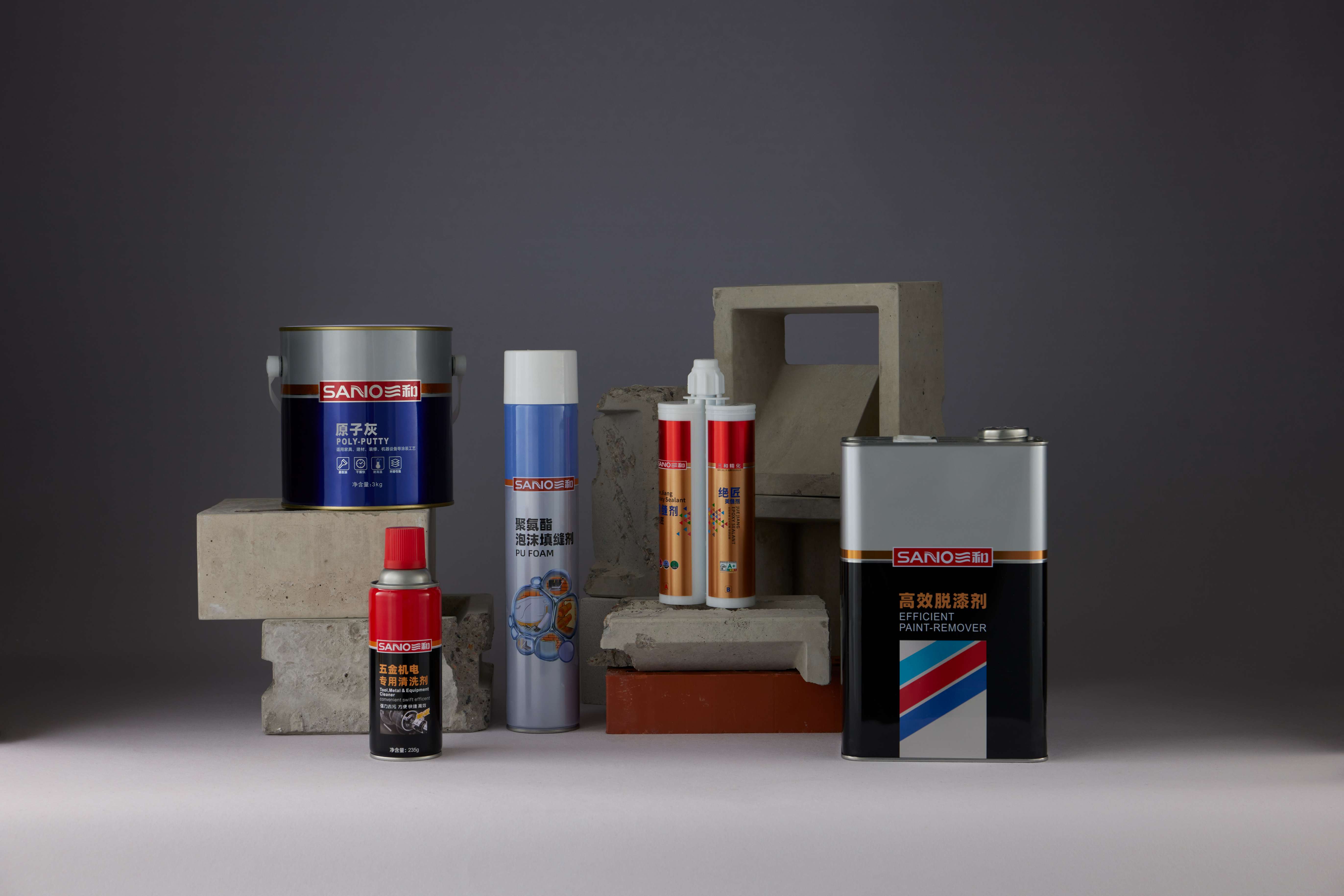
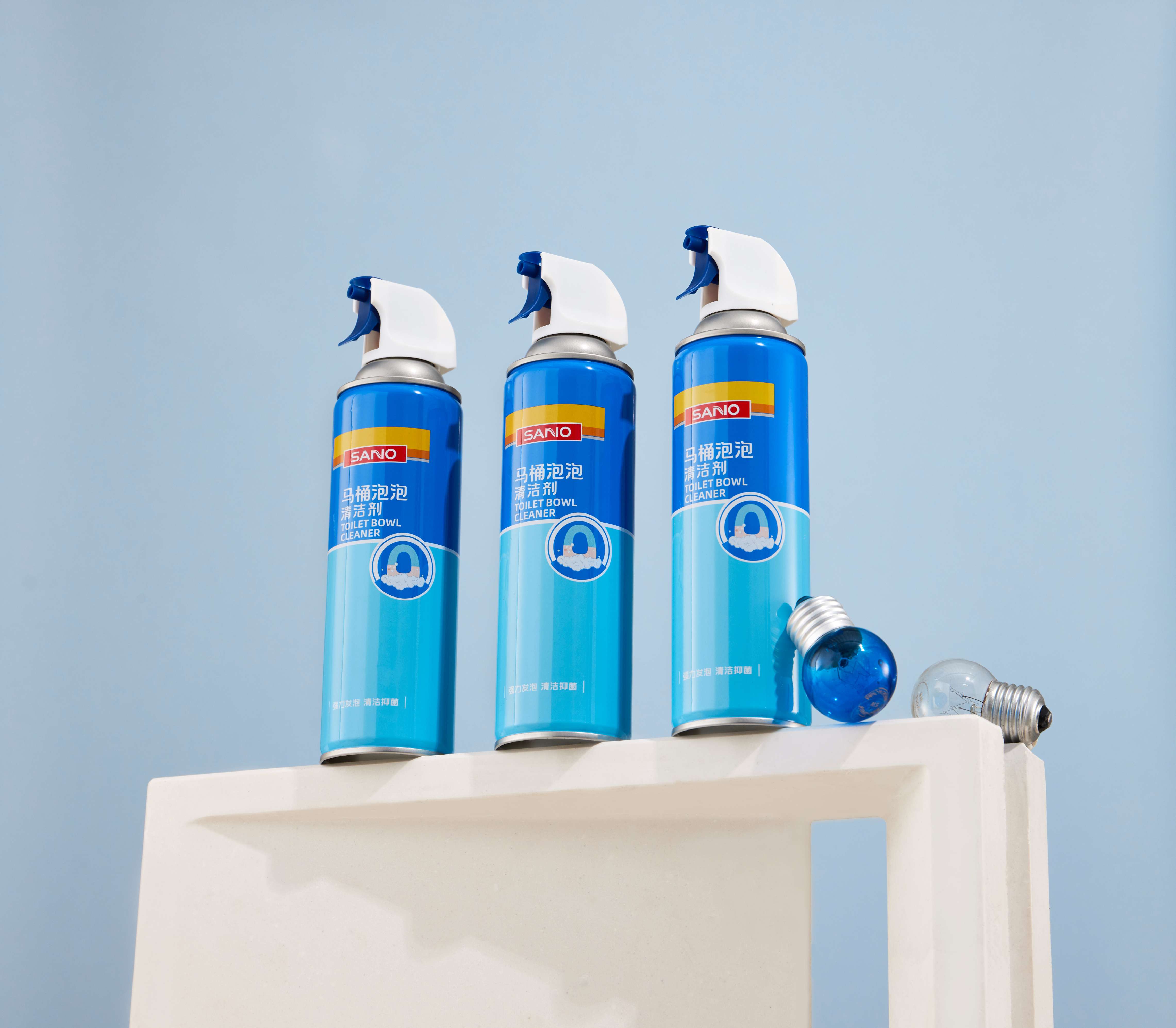
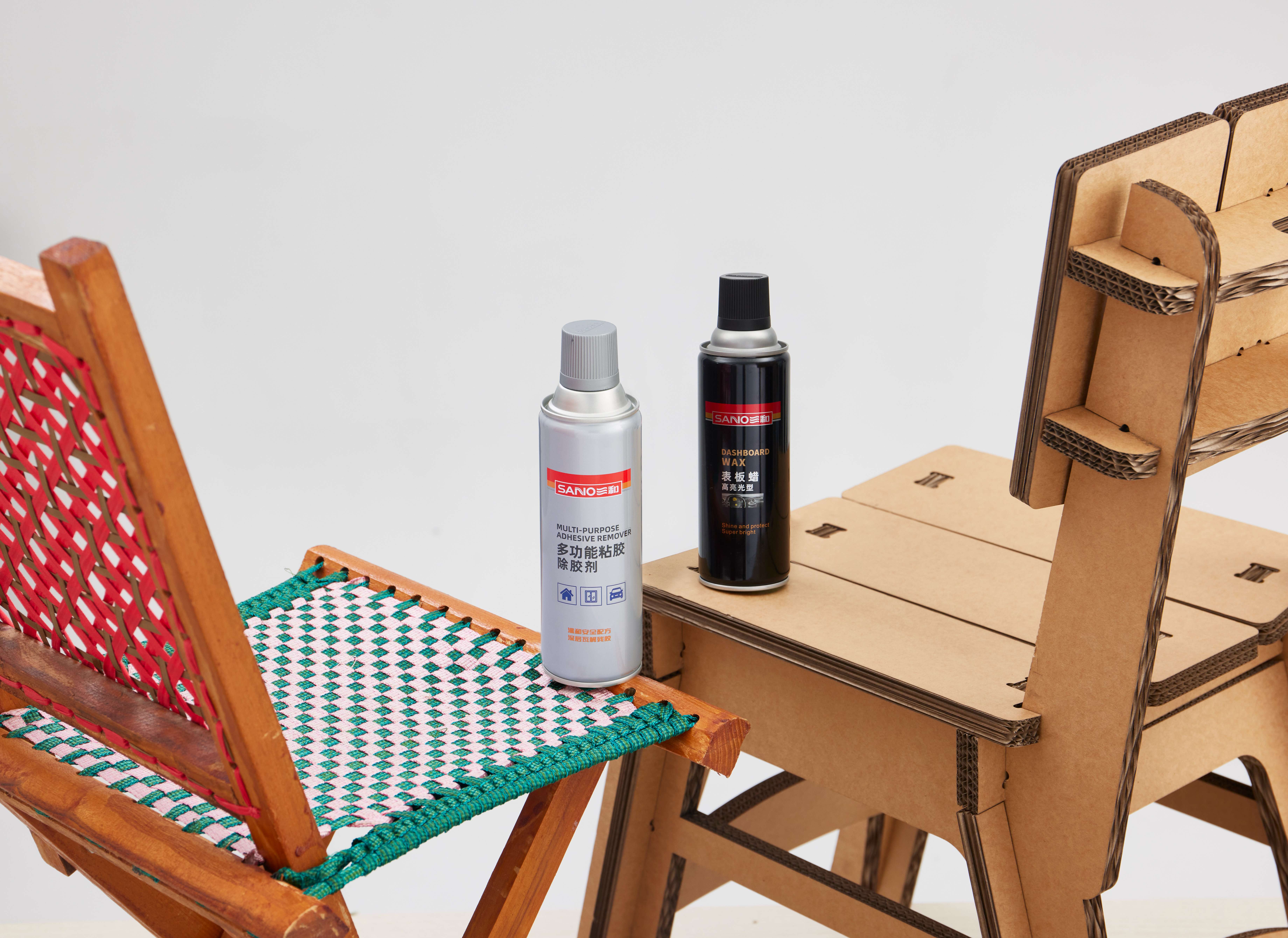
SANVO Fine Chemicals (HKEX: 0301.HK) is a publicly listed Chinese manufacturer with an established domestic market presence, now expanding into North America. The company needed a visual overhaul that could simultaneously elevate its brand image in China’s competitive consumer market and establish global credibility for international entry—all within an industry that defaults to aggressive, catalog-style product marketing. The central creative decision was to treat each product as a sculptural object rather than a commodity. Across four distinct product series, four parallel visual worlds were developed. Each features its own material palette, lighting logic, and emotional register, yet all are unified by a "Swiss-Red" color system that anchors SANVO’s brand identity throughout: · Construction Series: Adopts the language of brutalist architecture. Through hard side-lighting and geometric tension, products are stacked and suspended as structural forms on raw concrete. · Household Series: Builds a monochromatic blue world of laboratory clarity. The visual language speaks of precision instruments, not conventional cleaning supplies. · E-commerce Series: Targets Gen Z buyers on digital platforms through a warm, tactile DIY aesthetic, utilizing cardboard, wooden ladders, and washi tape as curated props. · Automotive Series: Plunges into full "garage noir." Deep black backgrounds, hard spotlights, and curated disorder are punctuated only by the signature Swiss-Red. Every prop was carefully selected and positioned on set to ensure each physical form—whether a can, tube, spray bottle, or tin—was registered as a designed object worthy of attention. The resulting campaign assets are deployed across SANVO’s visual and branding content ecosystem and official website, serving both domestic audiences and the company’s emerging international market. This project demonstrates how editorial still-life photography and systematic art direction can elevate an entire product portfolio from an industrial commodity to a premium brand experience, without fabricating what the products actually are.
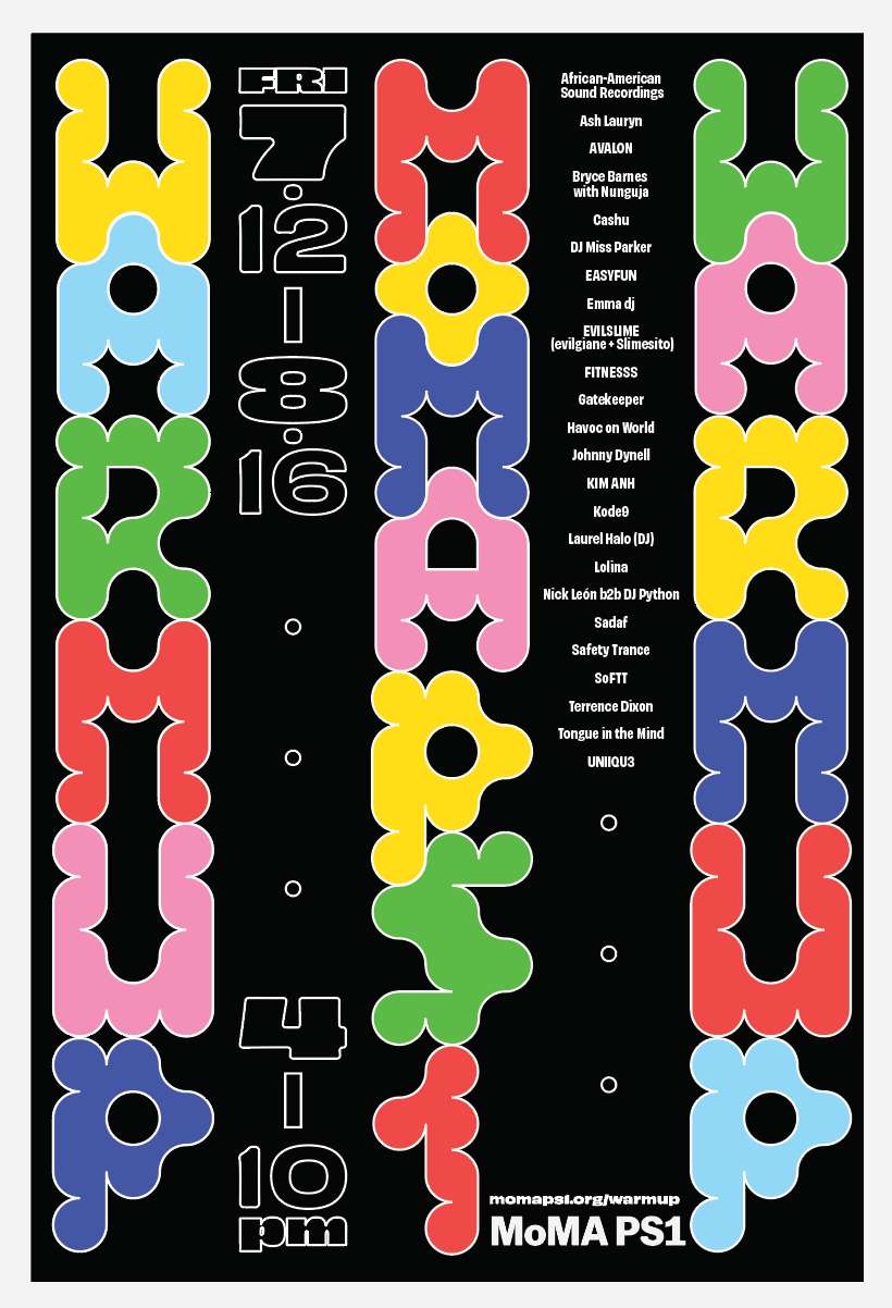
MoMA PS1 Warm Up Festival Rebranding

.png?alt=media&token=23d27bc8-fe00-44ec-99e4-2a409d860c3d)