WINNER WINNER WINNER WINNER WINNER WINNER WINNER


Summer 2025 - WINNER
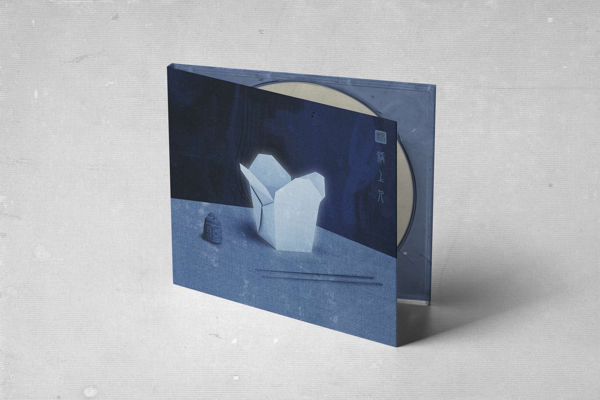
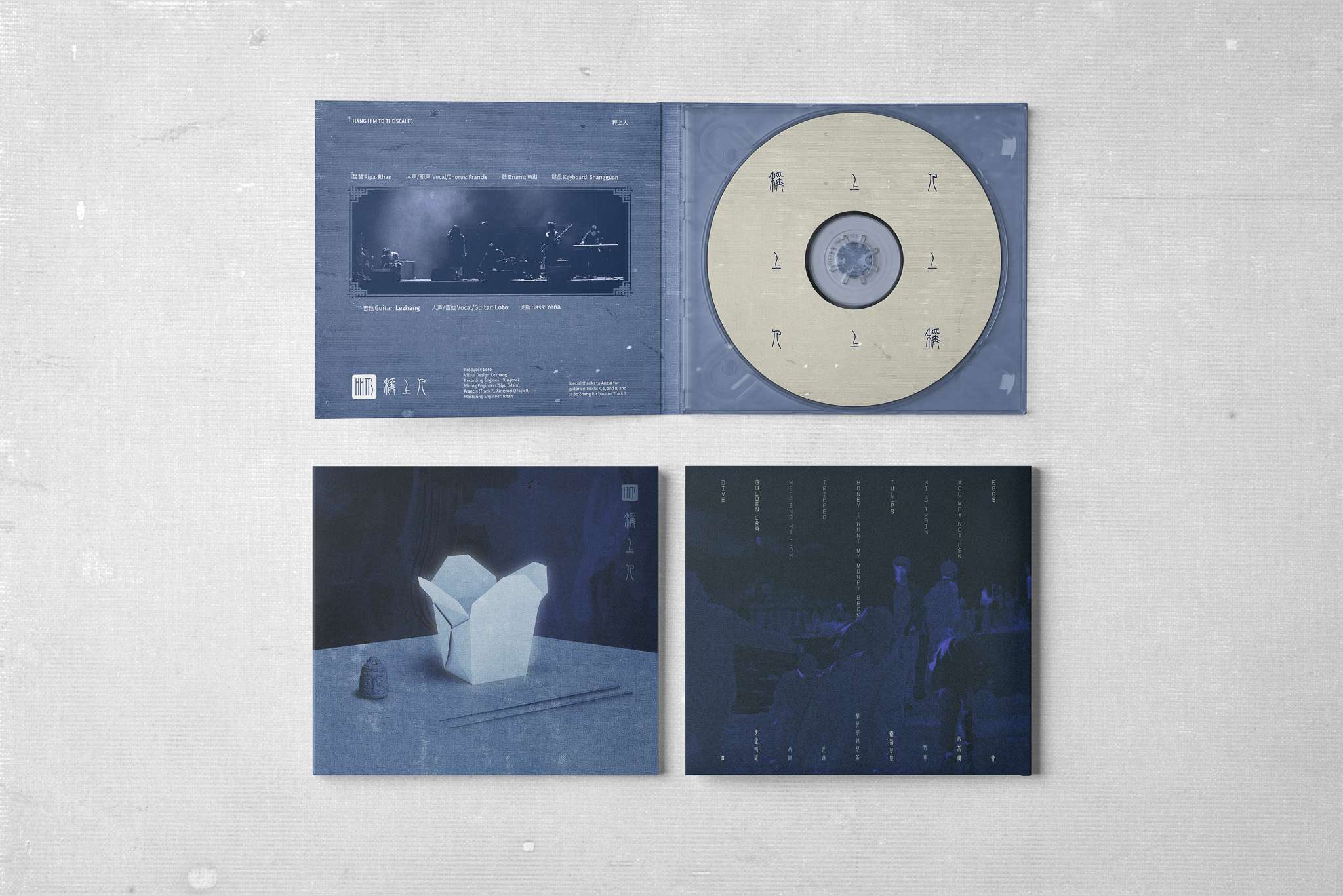
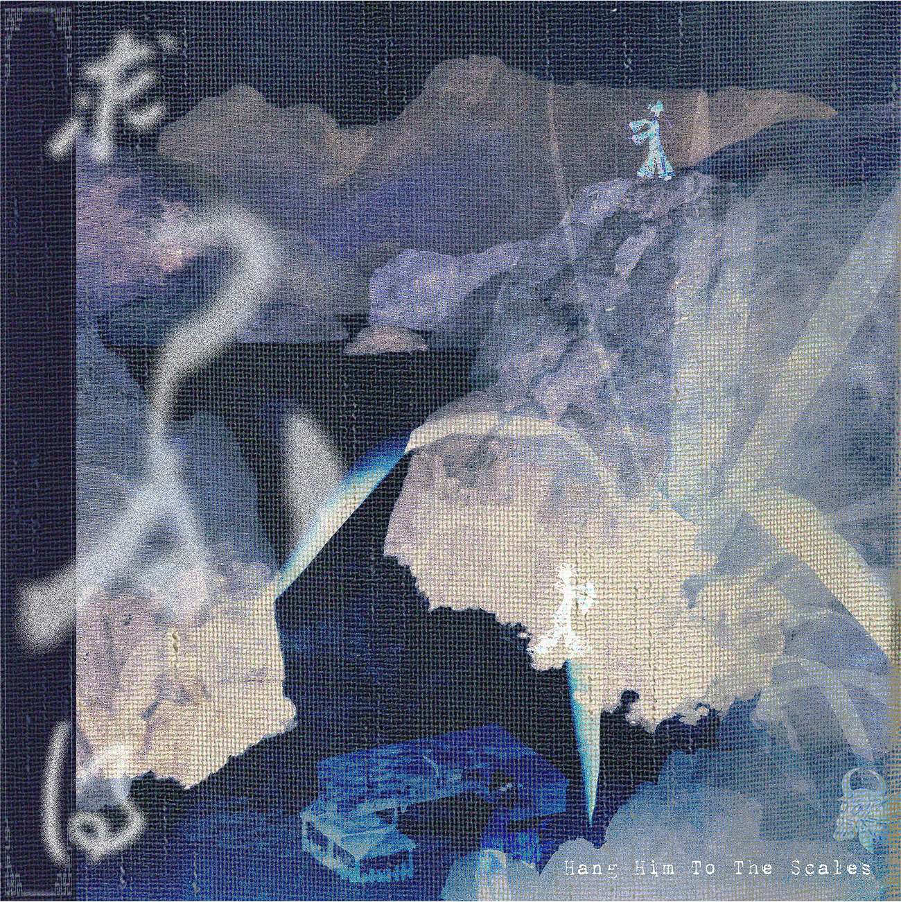
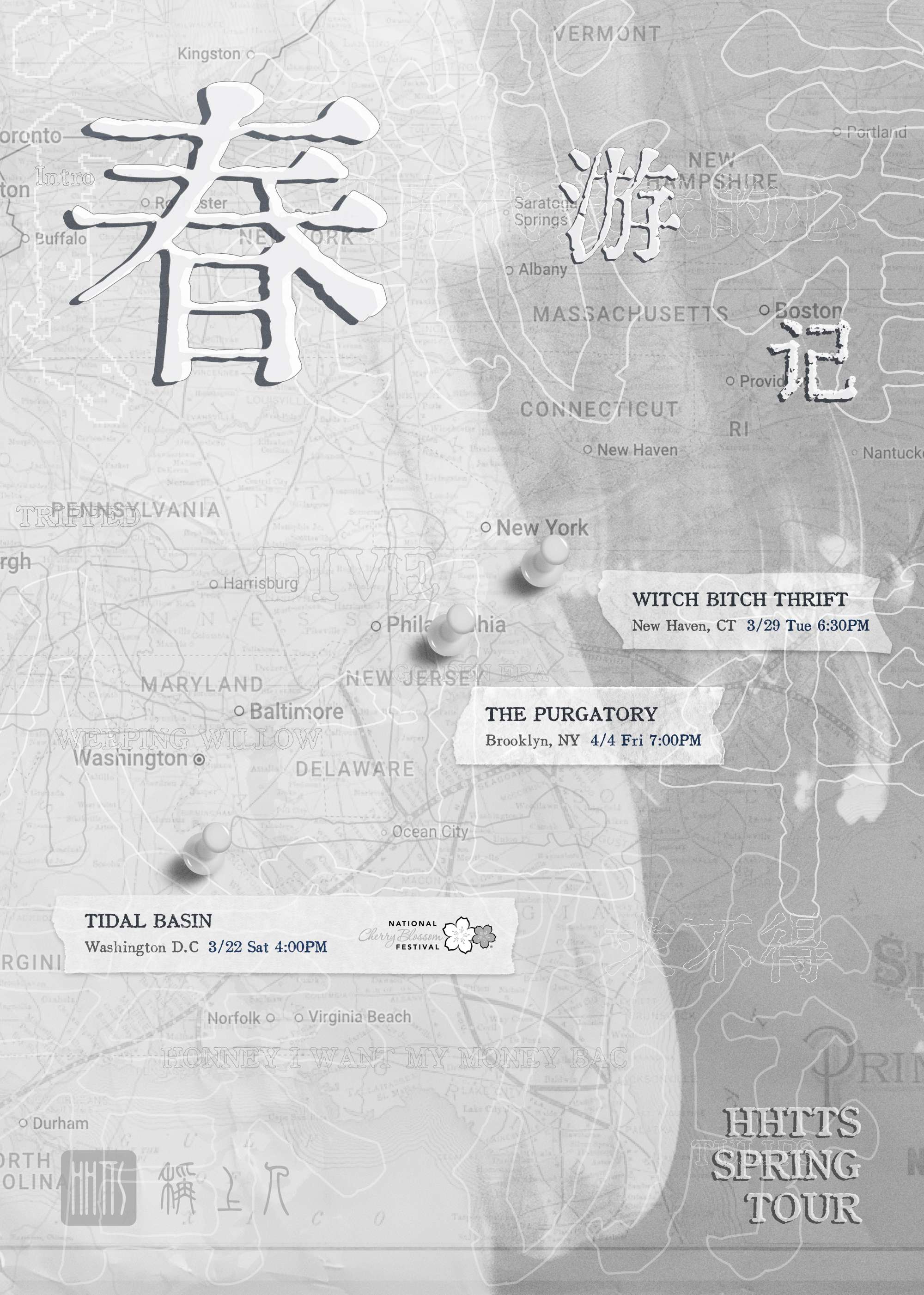
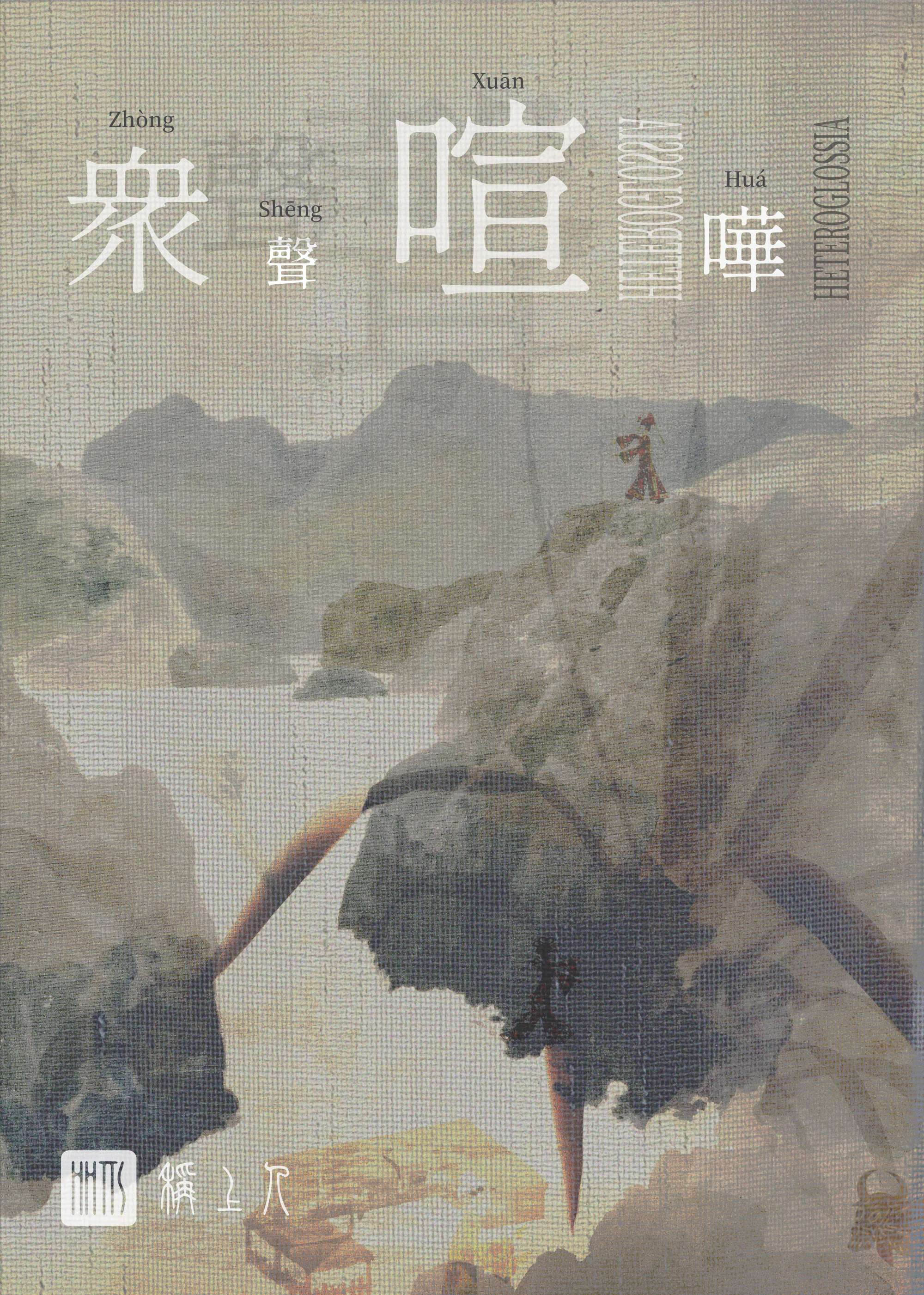
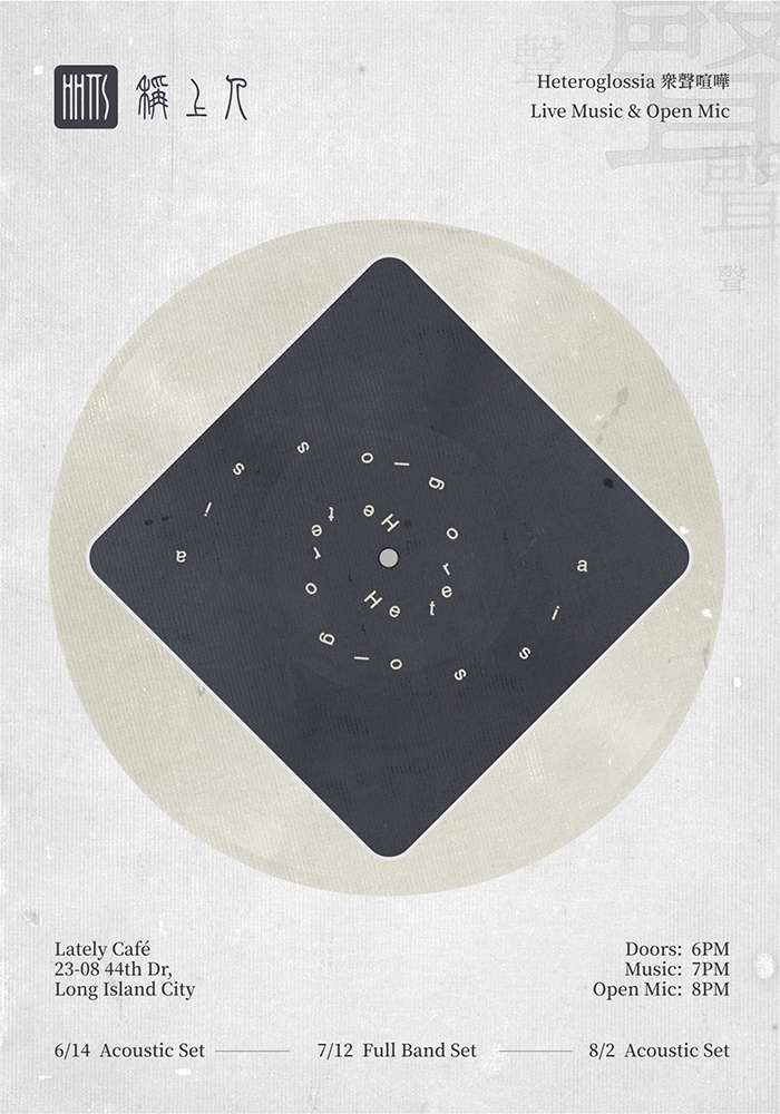
This project presents the visual identity design for Hang Him to the Scales, a New York–based band blending shoegaze, dream pop, and alternative rock with elements of Chinese folk tradition. The design challenge was not only to create a logo or a poster, but to establish a unified system spanning album artwork, concert posters, stage visuals, and live VJ performances, ensuring that every visual encounter resonates with the same aesthetic language. The band itself has emerged as a distinctive new voice in the Asian diaspora music scene, with performances at the National Cherry Blossom Festival in Washington D.C., the International Festival of Arts & Ideas, and key New York venues. Their work has been supported by a NYSCA Arts Grant and profiled in People’s Daily Overseas and RADII, underscoring their growing cultural impact. The identity draws inspiration from seal script typography, indigo dyeing, and the atmospheric textures of shoegaze. Through this synthesis, the visuals echo the band’s sound, layered, melancholic, and immersive, while building a consistent and recognizable presence across media.

Mellowee is a conceptual menstrual care subscription brand designed to make an essential product feel personal, soft, and natural. At the heart of the project is customization: customers can set their own delivery cycle to match their menstrual rhythm and build a package that reflects their needs. Depending on flow, length, or personal preference, users can choose different sizes and quantities of pads, creating a subscription that feels both practical and uniquely their own. The brand name combines Mellow—symbolizing softness and calm—with Wee, where We represents togetherness and the added e stands for the consumer. This reflects Mellowee’s vision of a brand built alongside its users, positioning menstrual care as a natural, supportive part of daily life. The brand’s core values are Customization, Softness, and Sustainability. These are expressed not only through the service but also the design. Products are framed as natural, everyday essentials, and packaging highlights both emotional warmth and environmental awareness. Visual identity reinforces this philosophy through pastel tones of baby pink, deep green, pastel yellow, and magenta pink. Watercolor-inspired textures convey fluidity and softness, while rounded, cloud-like typography adds a friendly and approachable touch. The packaging system emphasizes ease and delight, making the unboxing moment feel special rather than routine. With the tagline “Everyday & Feel Special,” Mellowee challenges the idea that menstrual care must be clinical or impersonal. Instead, it reimagines it as a personalized, thoughtful experience that values comfort, inclusivity, and emotional well-being.

LooperRoom App is an AI-powered mental health support platform designed to bridge the gap between therapy sessions. Created for both patients and clinicians, it combines friendly chatbot interactions with clinician-facing dashboards to reduce patient dropout and strengthen continuity of care. I led the end-to-end product design—from user flows and questionnaire logic to interface systems and enterprise-level clinician tools. My work included designing conditional form logic based on patient age, setting up modular components for responsive UI, and crafting a tone that balances trustworthiness with approachability. I also collaborated closely with PMs and engineers to ensure clinical accuracy and data compliance. LooperRoom is not a virtual therapist, but a connective system—keeping patients engaged, informed, and emotionally supported between sessions. As a designer, I focused on creating an ecosystem that empowers both sides of care: patients and providers. The result is a product that is scalable, accessible, and deeply human-centered.