WINNER WINNER WINNER WINNER WINNER WINNER WINNER


Summer 2025 - WINNER
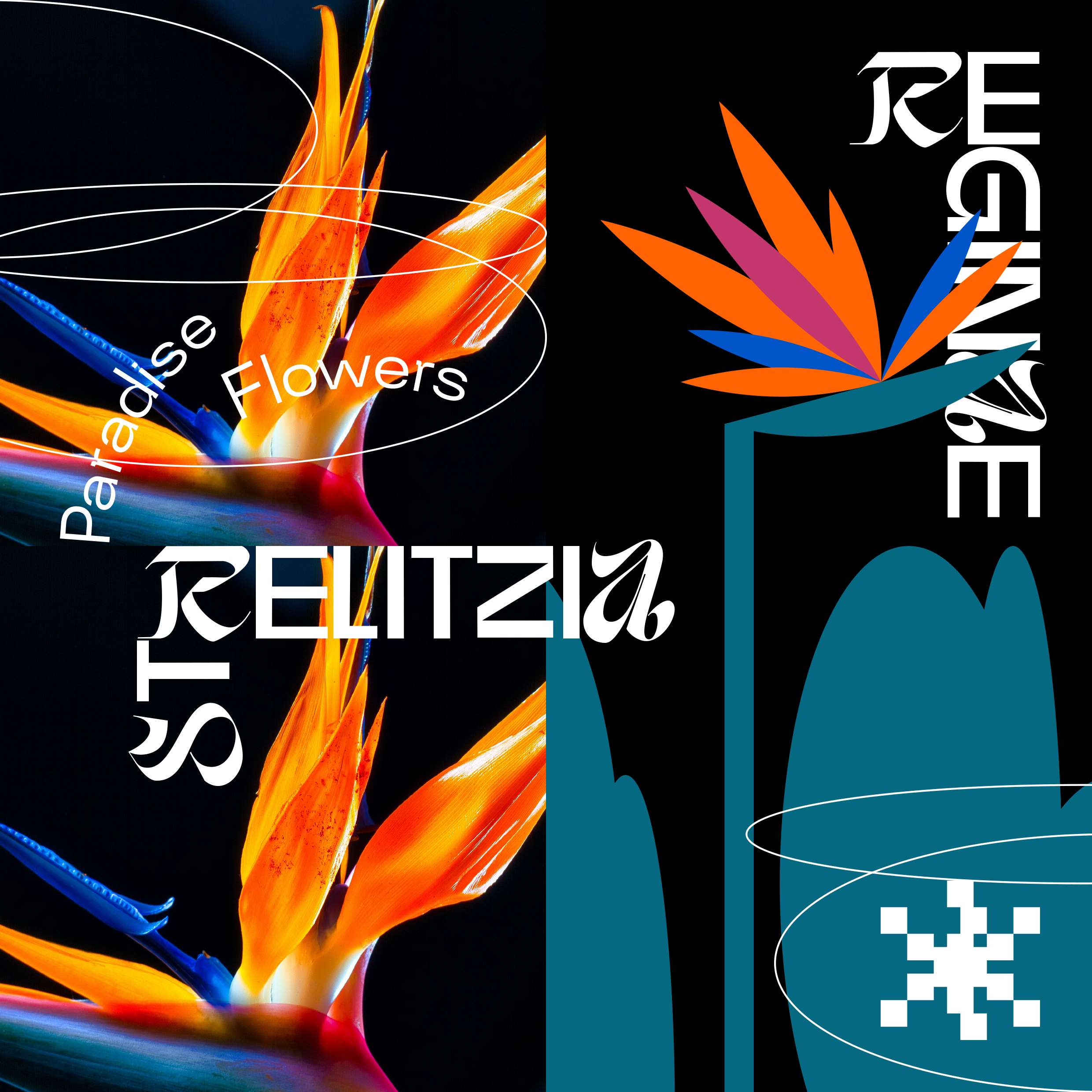
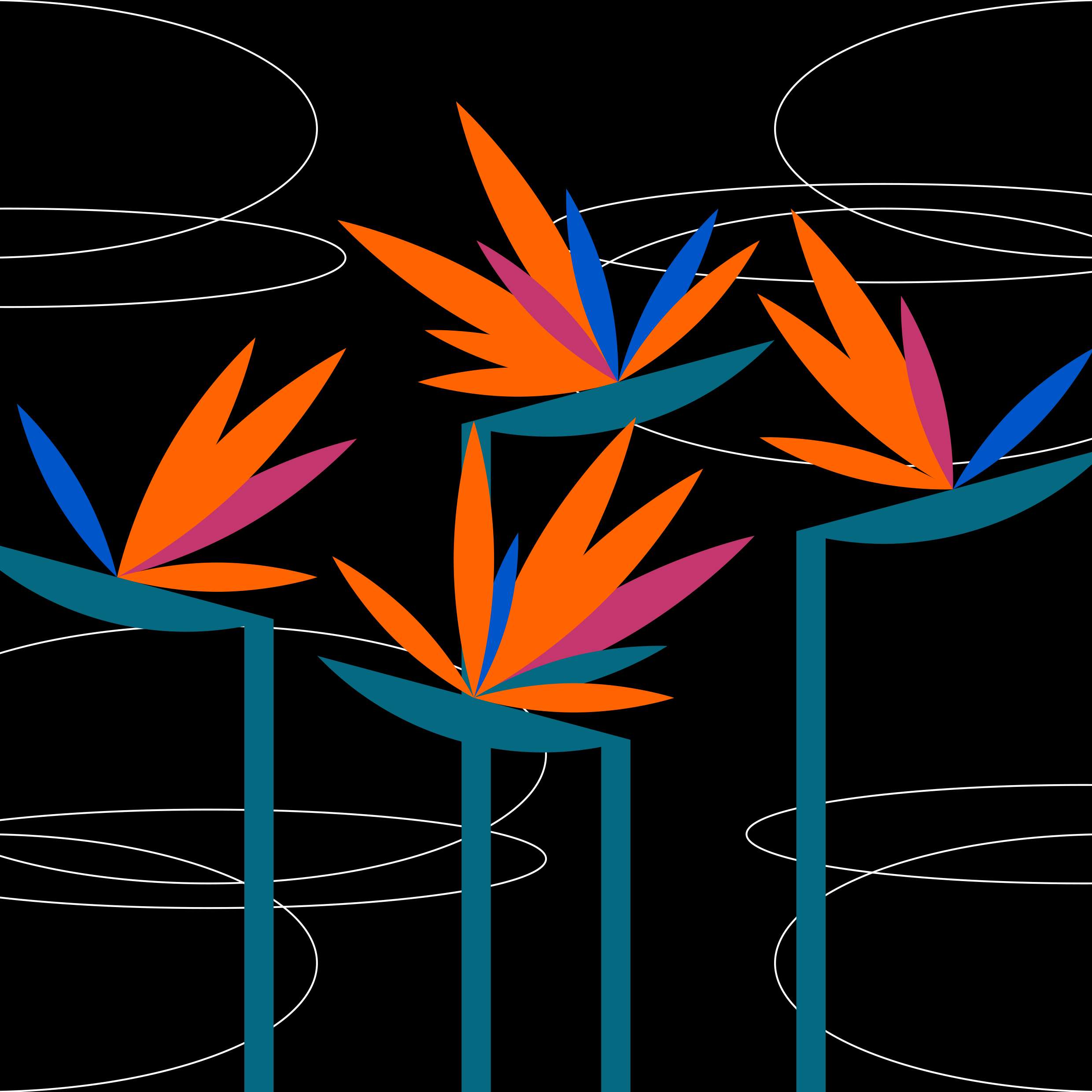
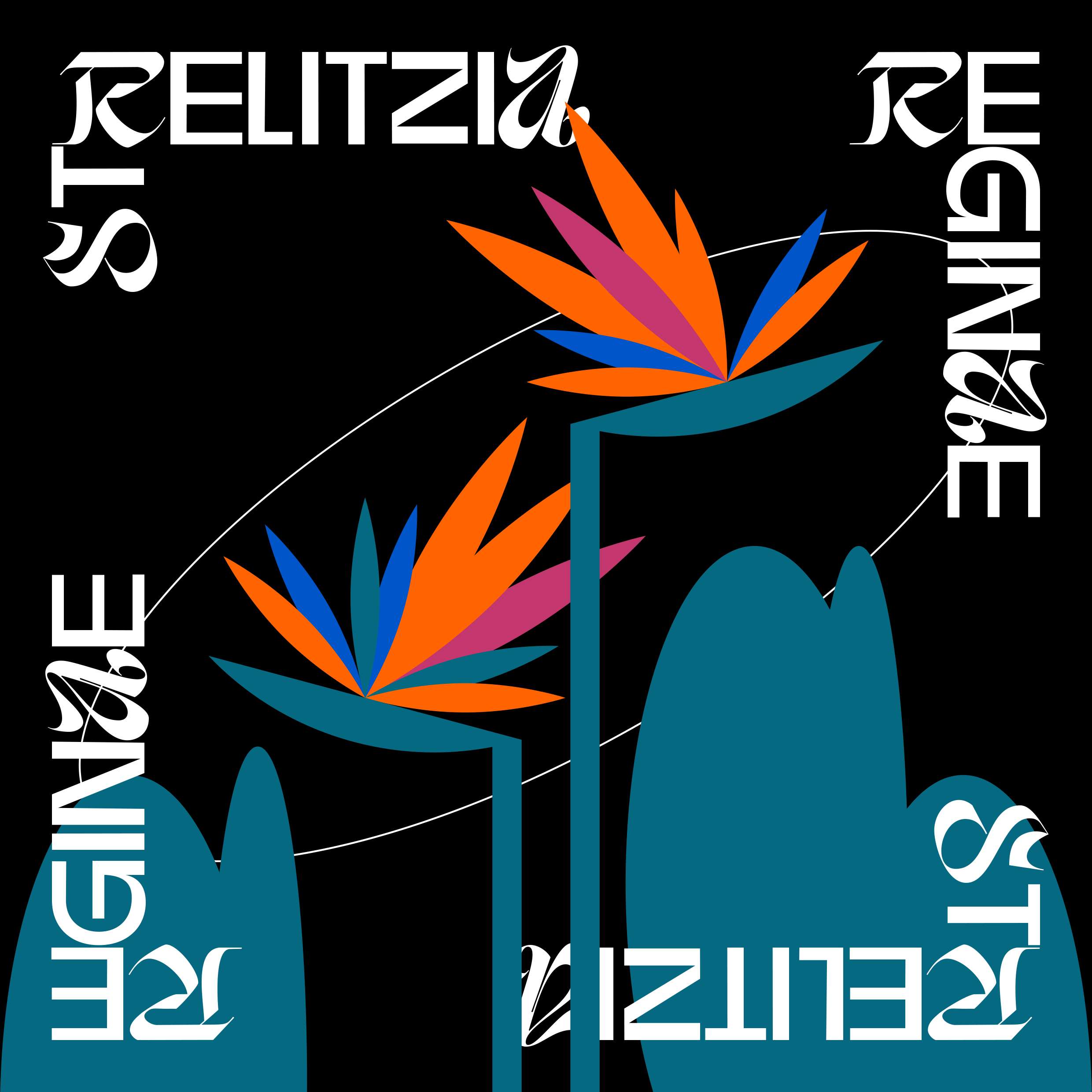
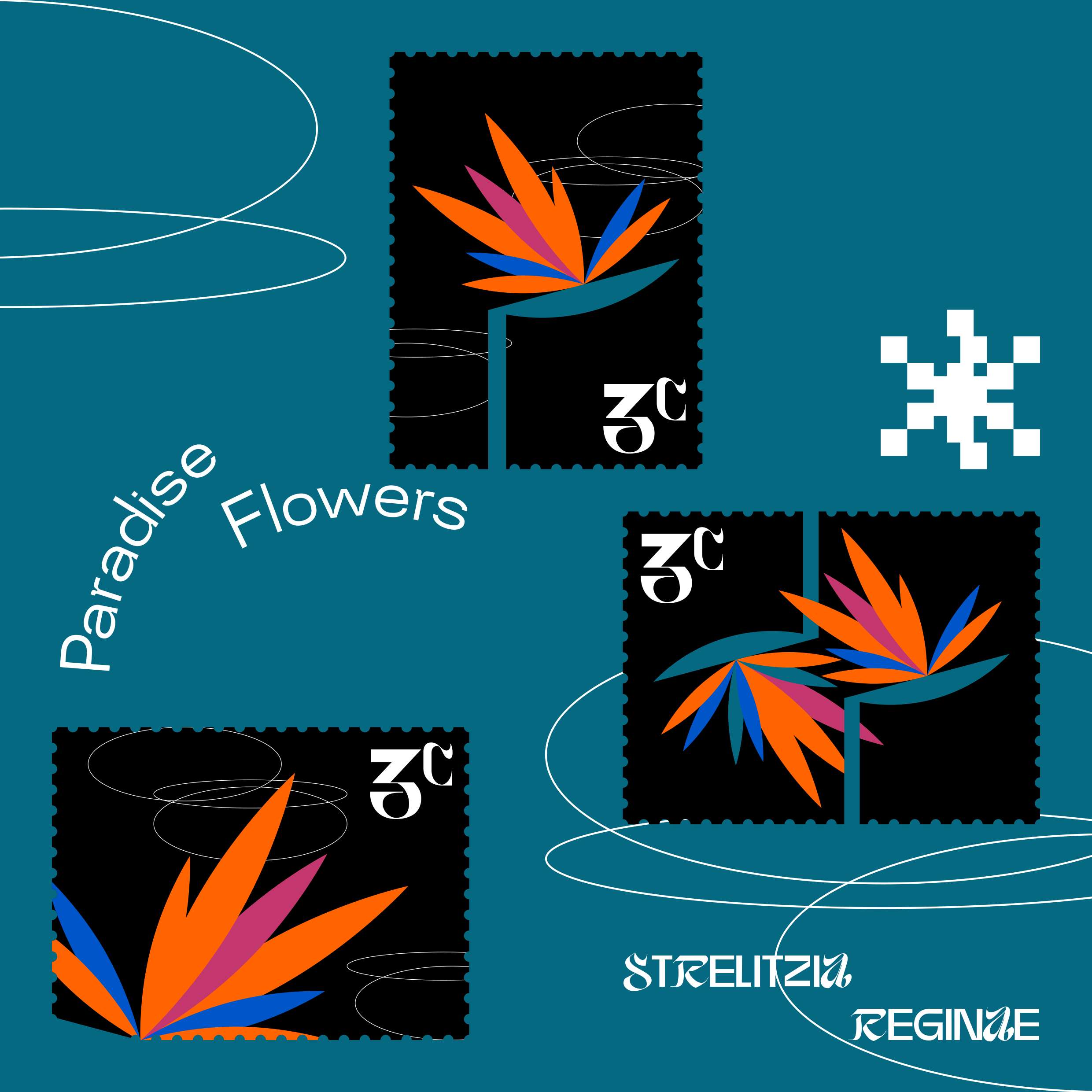
I'm Yedio, a freelance graphic designer from Taiwan. I specialize in creating vibrant and distinctive visuals by blending geometric shapes and bold color blocks. My work often has a fresh, fashionable, and airy feel, as I love to explore new ways of playing with color and form. My passion lies in crafting designs that are unique and full of energy. I aim to consistently challenge the expected, creating fresh visual experiences that truly stand out. While my creative process is rooted in design principles, my personal interests in astrology and tarot help me cultivate a unique perspective on the world. This focus on symbolism and archetypes informs how I view and interpret beauty, bringing a deeper layer to my work. The series I'm submitting, Strelitzia Reginae, is a tribute to my favorite plant, the bird of paradise. I view this magnificent South African native, named after Queen Charlotte, as "the queen of flowers." Its striking elegance and crown-like colors embody the regal beauty that inspires this project. By blending the plant's natural grace with elements of fashion, this collection of visuals aims to capture a sense of both elegance and raw power. I hope you enjoy the work. More of my work: https://www.instagram.com/_yedio_

Mellowee is a conceptual menstrual care subscription brand designed to make an essential product feel personal, soft, and natural. At the heart of the project is customization: customers can set their own delivery cycle to match their menstrual rhythm and build a package that reflects their needs. Depending on flow, length, or personal preference, users can choose different sizes and quantities of pads, creating a subscription that feels both practical and uniquely their own. The brand name combines Mellow—symbolizing softness and calm—with Wee, where We represents togetherness and the added e stands for the consumer. This reflects Mellowee’s vision of a brand built alongside its users, positioning menstrual care as a natural, supportive part of daily life. The brand’s core values are Customization, Softness, and Sustainability. These are expressed not only through the service but also the design. Products are framed as natural, everyday essentials, and packaging highlights both emotional warmth and environmental awareness. Visual identity reinforces this philosophy through pastel tones of baby pink, deep green, pastel yellow, and magenta pink. Watercolor-inspired textures convey fluidity and softness, while rounded, cloud-like typography adds a friendly and approachable touch. The packaging system emphasizes ease and delight, making the unboxing moment feel special rather than routine. With the tagline “Everyday & Feel Special,” Mellowee challenges the idea that menstrual care must be clinical or impersonal. Instead, it reimagines it as a personalized, thoughtful experience that values comfort, inclusivity, and emotional well-being.

LooperRoom App is an AI-powered mental health support platform designed to bridge the gap between therapy sessions. Created for both patients and clinicians, it combines friendly chatbot interactions with clinician-facing dashboards to reduce patient dropout and strengthen continuity of care. I led the end-to-end product design—from user flows and questionnaire logic to interface systems and enterprise-level clinician tools. My work included designing conditional form logic based on patient age, setting up modular components for responsive UI, and crafting a tone that balances trustworthiness with approachability. I also collaborated closely with PMs and engineers to ensure clinical accuracy and data compliance. LooperRoom is not a virtual therapist, but a connective system—keeping patients engaged, informed, and emotionally supported between sessions. As a designer, I focused on creating an ecosystem that empowers both sides of care: patients and providers. The result is a product that is scalable, accessible, and deeply human-centered.