SHORTLISTED


Summer 2025 - SHORTLISTED
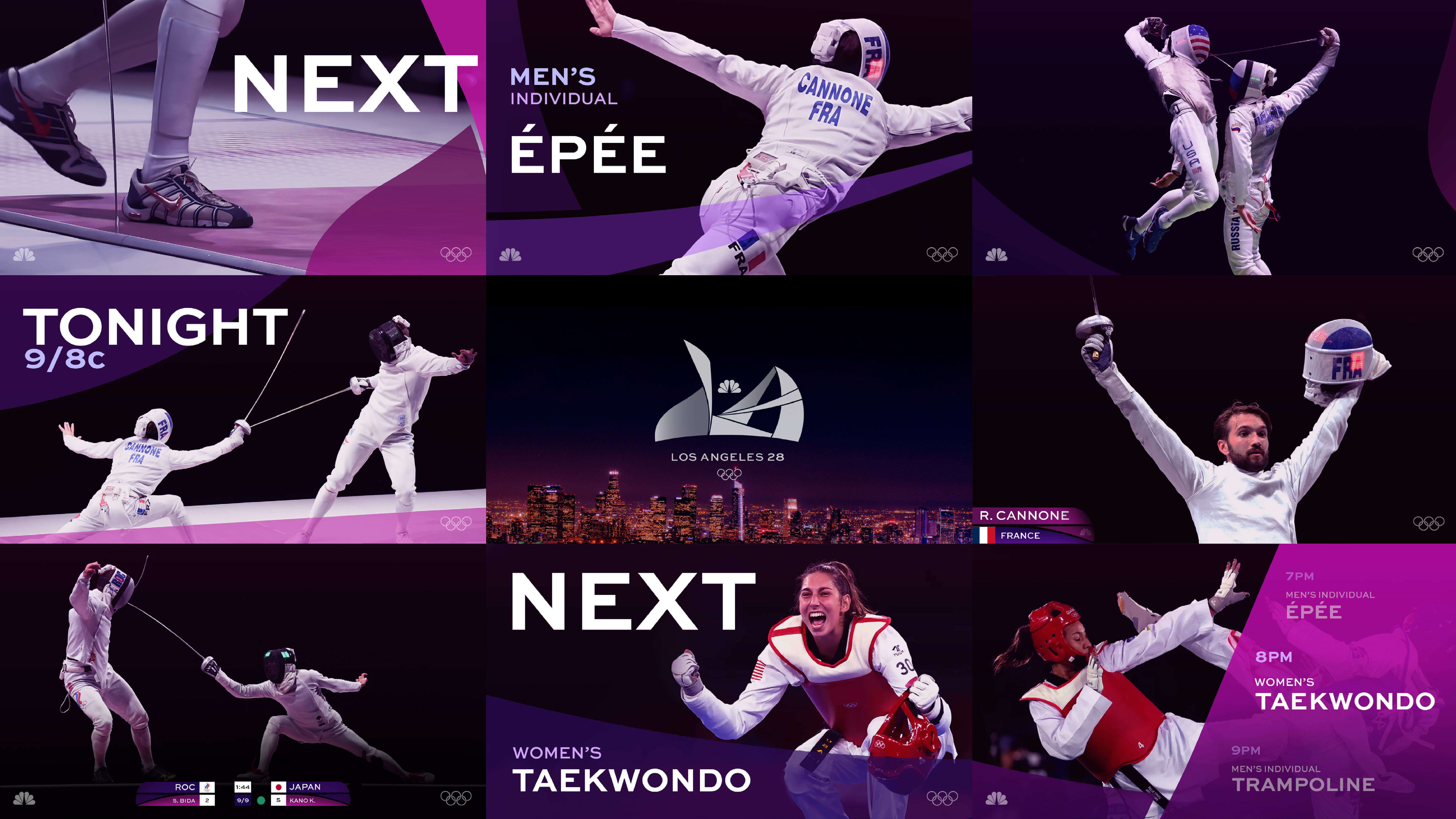
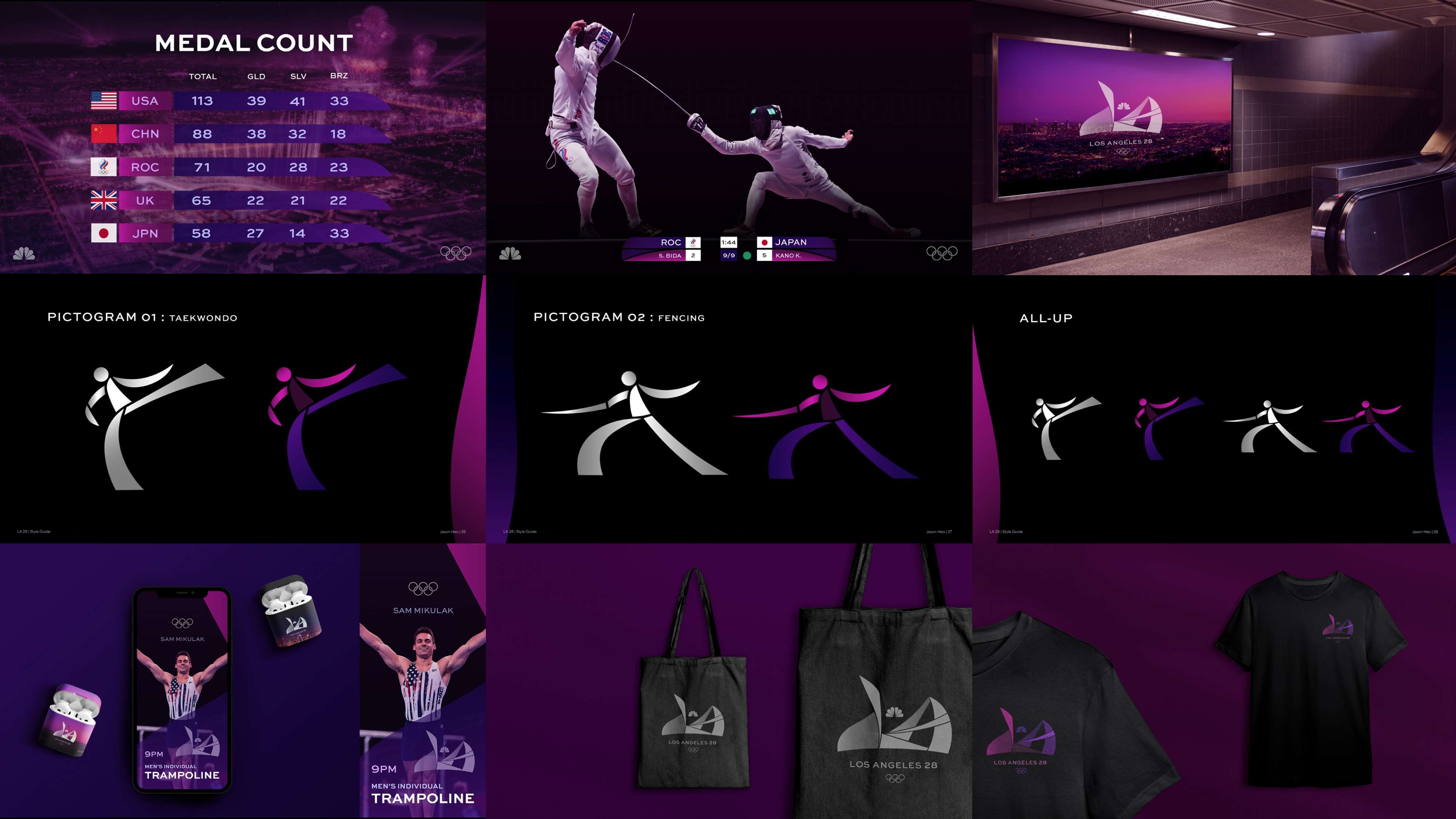
This conceptual branding project for the LA 2028 Olympics encompassed a comprehensive suite of design deliverables, including the logo, typeface, style guide, NBC Sports promo package, infographics, and off-air materials. The design direction was inspired by the unique character and energy of Los Angeles, translating the city’s vibrancy and architectural innovation into a visual language that celebrates the Olympics. The main idea for the logo originated from shapes borrowed from the Oscars’ stage set, reinterpreted into a simple, abstract form. The shape language, influenced by Postmodern architecture in Los Angeles, captures the dynamic movement of Olympic athletes, creating a sense of motion and energy while maintaining a bold, modern aesthetic. The logo’s “paper-folded” look, together with the typeface selection, reinforces this sense of dimensionality and playfulness. The aesthetic color palette was drawn from Los Angeles’ sky, sunsets, and night city lights, producing gradients that blend smoothly and harmoniously. These colors reflect the city’s atmospheric beauty and symbolize the Olympics as a union of diverse sports, highlighting each event as a distinct form of art. The wide typeface, Sweet Sans Pro Medium/Bold, echoes the logo’s curved and straight lines, ensuring visual cohesion across all applications, from on-air graphics to promotional materials. Overall, the project captures the spirit of Los Angeles and the Olympics, creating a vibrant, modern, and unified visual identity that celebrates athleticism, culture, and creativity.

Mellowee is a conceptual menstrual care subscription brand designed to make an essential product feel personal, soft, and natural. At the heart of the project is customization: customers can set their own delivery cycle to match their menstrual rhythm and build a package that reflects their needs. Depending on flow, length, or personal preference, users can choose different sizes and quantities of pads, creating a subscription that feels both practical and uniquely their own. The brand name combines Mellow—symbolizing softness and calm—with Wee, where We represents togetherness and the added e stands for the consumer. This reflects Mellowee’s vision of a brand built alongside its users, positioning menstrual care as a natural, supportive part of daily life. The brand’s core values are Customization, Softness, and Sustainability. These are expressed not only through the service but also the design. Products are framed as natural, everyday essentials, and packaging highlights both emotional warmth and environmental awareness. Visual identity reinforces this philosophy through pastel tones of baby pink, deep green, pastel yellow, and magenta pink. Watercolor-inspired textures convey fluidity and softness, while rounded, cloud-like typography adds a friendly and approachable touch. The packaging system emphasizes ease and delight, making the unboxing moment feel special rather than routine. With the tagline “Everyday & Feel Special,” Mellowee challenges the idea that menstrual care must be clinical or impersonal. Instead, it reimagines it as a personalized, thoughtful experience that values comfort, inclusivity, and emotional well-being.

LooperRoom App is an AI-powered mental health support platform designed to bridge the gap between therapy sessions. Created for both patients and clinicians, it combines friendly chatbot interactions with clinician-facing dashboards to reduce patient dropout and strengthen continuity of care. I led the end-to-end product design—from user flows and questionnaire logic to interface systems and enterprise-level clinician tools. My work included designing conditional form logic based on patient age, setting up modular components for responsive UI, and crafting a tone that balances trustworthiness with approachability. I also collaborated closely with PMs and engineers to ensure clinical accuracy and data compliance. LooperRoom is not a virtual therapist, but a connective system—keeping patients engaged, informed, and emotionally supported between sessions. As a designer, I focused on creating an ecosystem that empowers both sides of care: patients and providers. The result is a product that is scalable, accessible, and deeply human-centered.