WINNER WINNER WINNER WINNER WINNER WINNER WINNER


Summer 2025 - WINNER
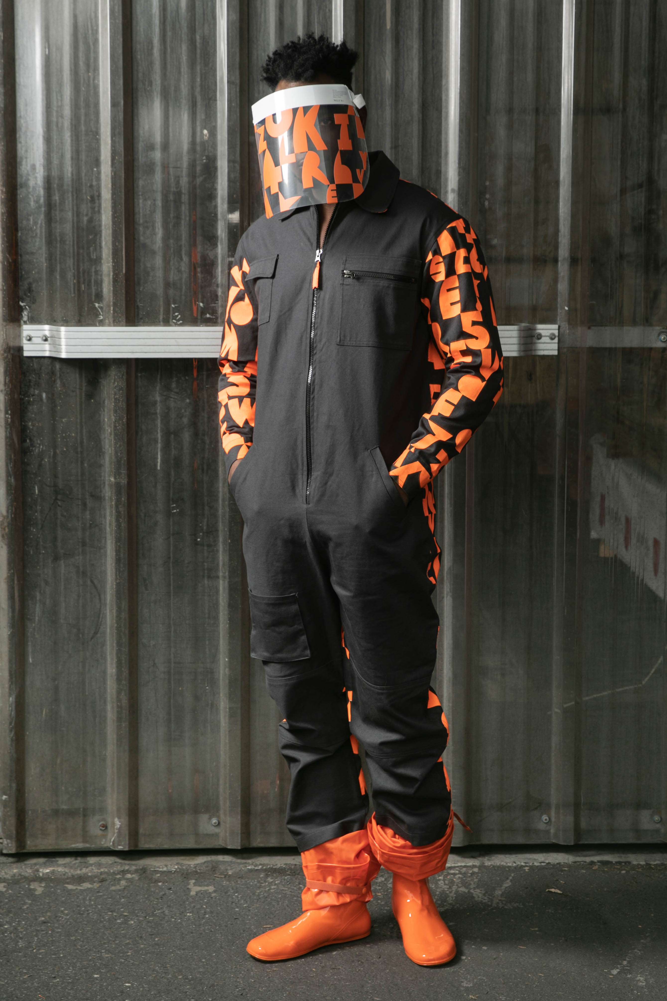
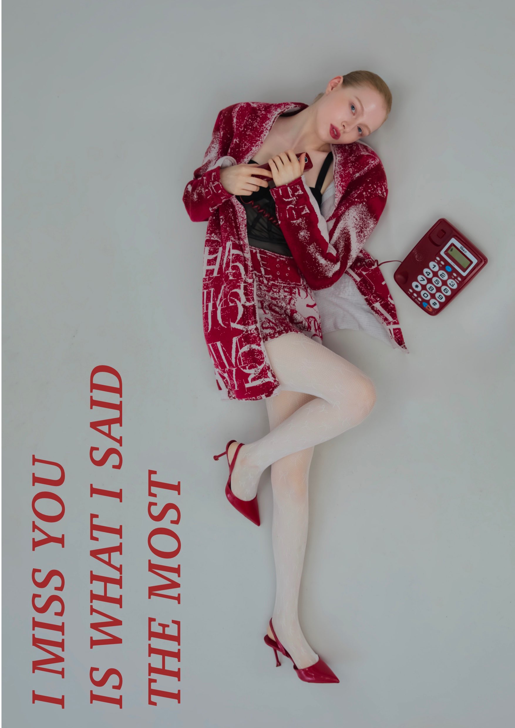
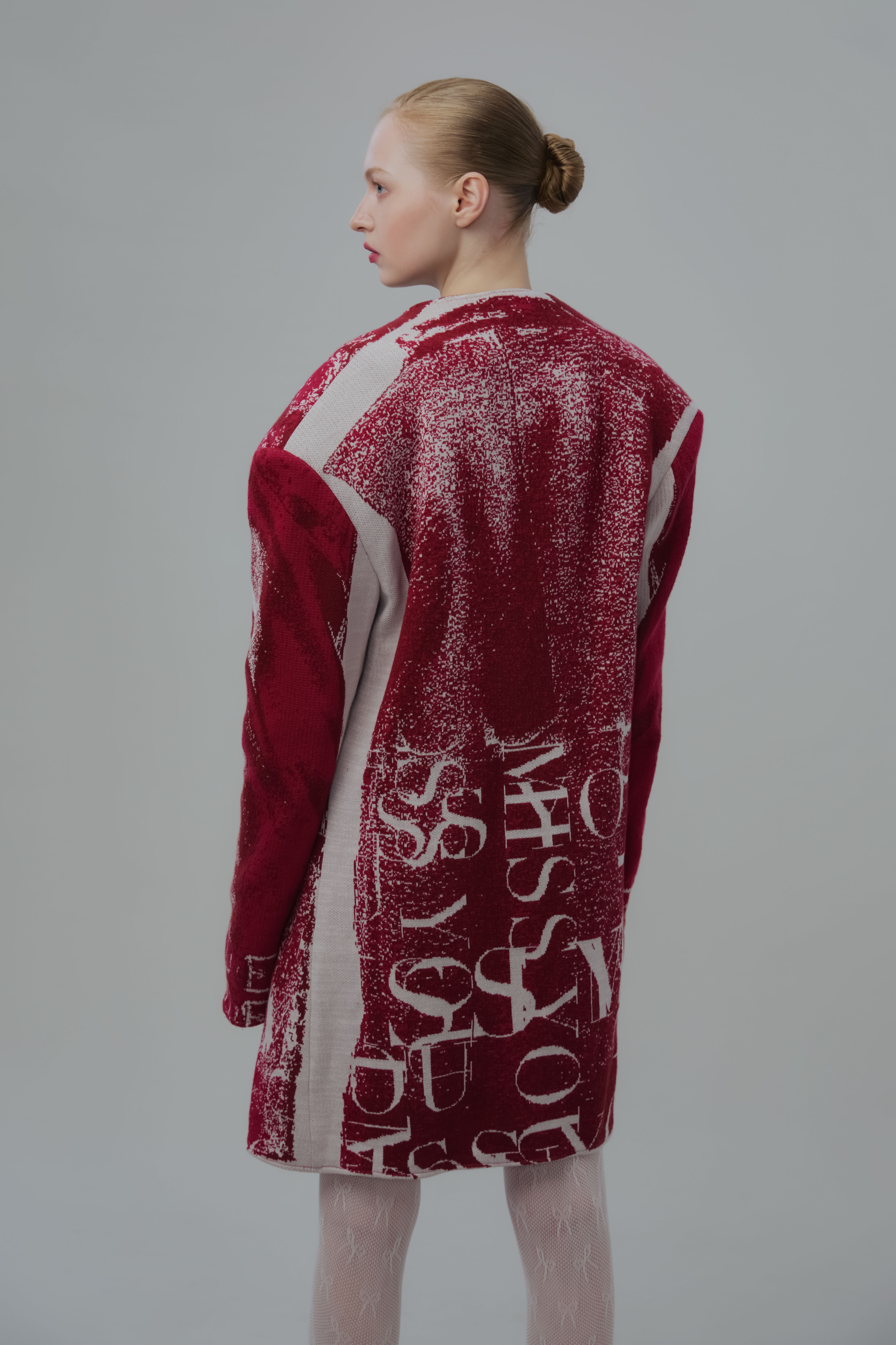
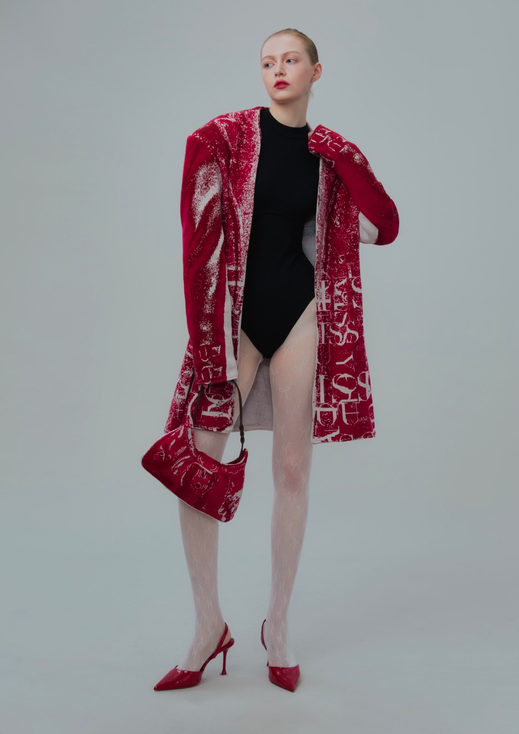
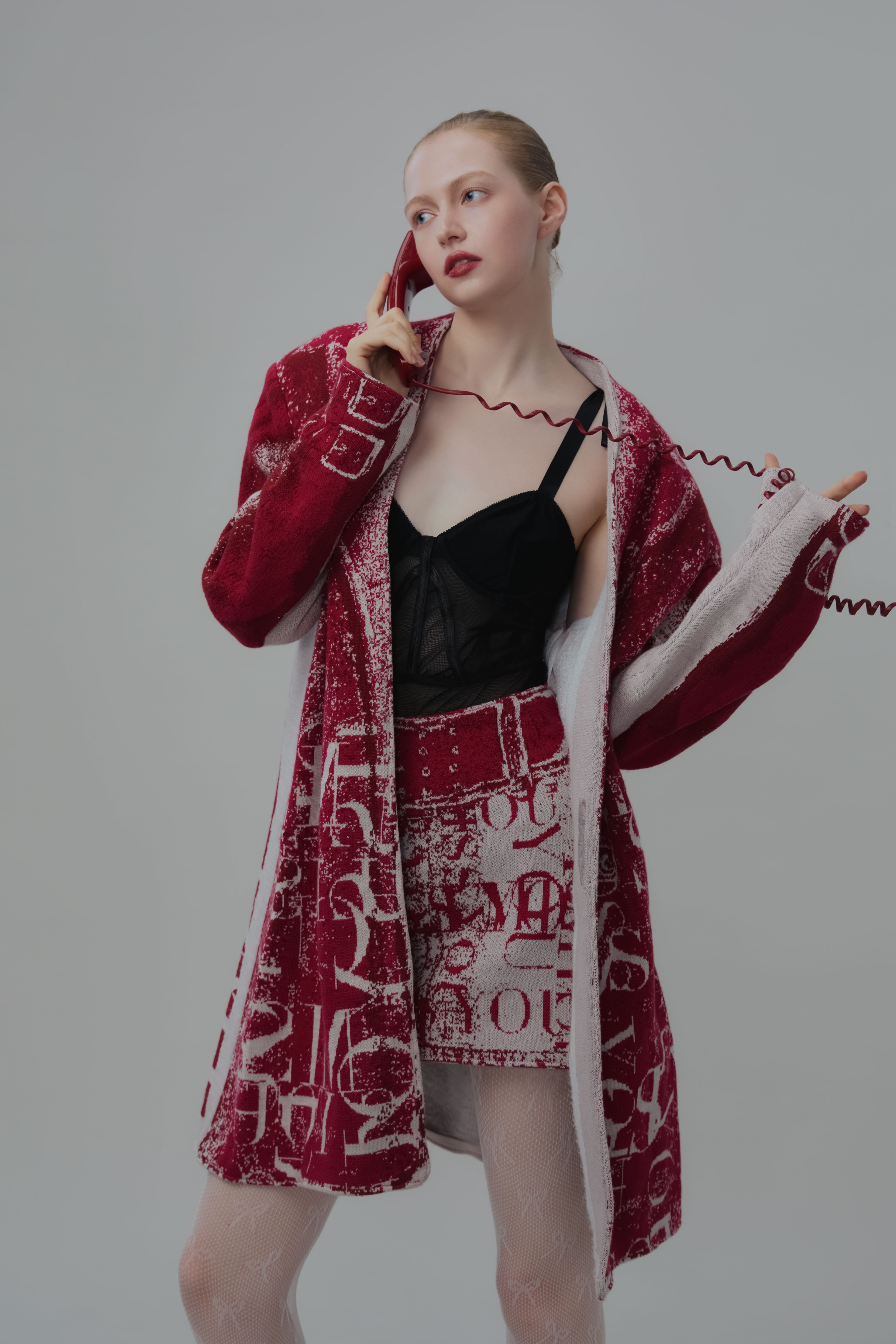
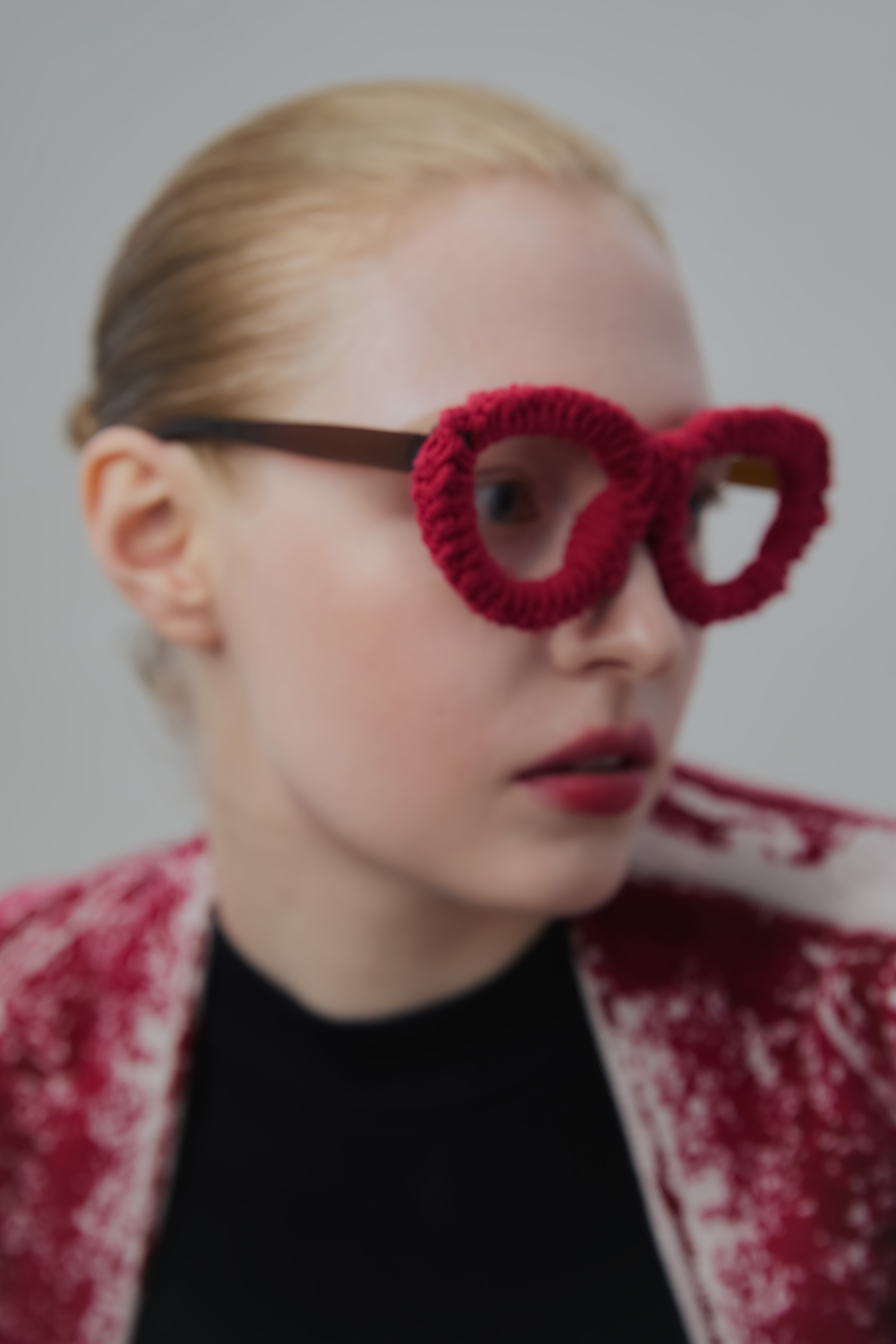
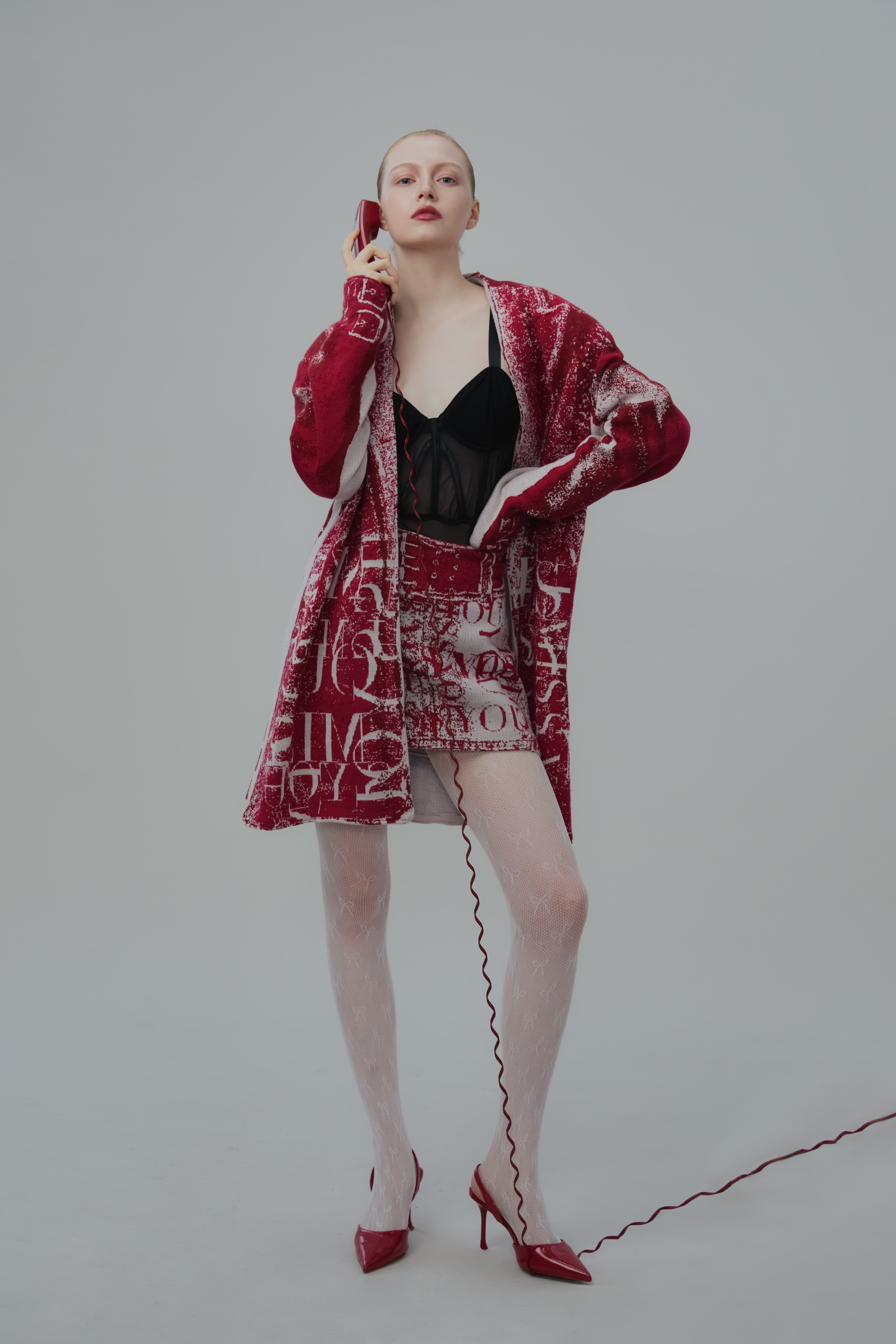
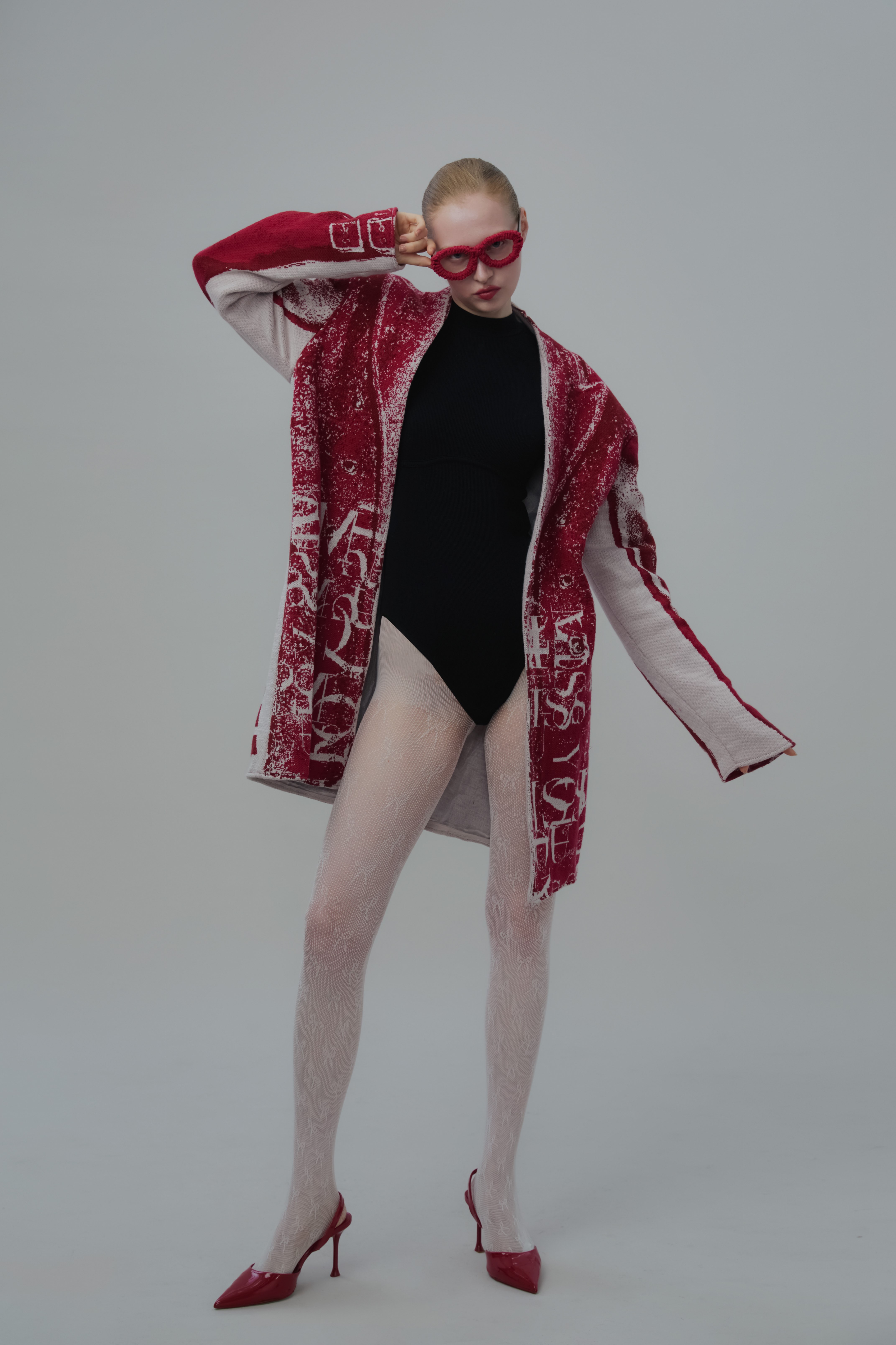
This collection is inspired by the realisation that in a long-distance relationship, we often say "I miss you" more than "I love you" — a phrase that reflects an unreachable longing and yearning, trapped behind a phone screen, reduced to cold yet honest text and images. Using jacquard knitting techniques, I wove images of clothing directly into the fabric, creating an illusion where the virtual and the real blur — like seeing someone through a screen: clearly there, yet untouchable. This "flat illusion" symbolises both the authenticity and limitations of digital emotion. The lace patchwork incorporated into the series represents the romance and tenderness that still exist within relationships — a longing for genuine connection, even when wrapped in rationality and technology. The overall design responds to how people today rely on mobile phones to maintain relationships, while also attempting to transform those compressed, delayed, and distorted emotions into wearable pieces with warmth. This is an experiment in expressing emotion through knitting — a question and a gaze directed at love in the digital age.

Mellowee is a conceptual menstrual care subscription brand designed to make an essential product feel personal, soft, and natural. At the heart of the project is customization: customers can set their own delivery cycle to match their menstrual rhythm and build a package that reflects their needs. Depending on flow, length, or personal preference, users can choose different sizes and quantities of pads, creating a subscription that feels both practical and uniquely their own. The brand name combines Mellow—symbolizing softness and calm—with Wee, where We represents togetherness and the added e stands for the consumer. This reflects Mellowee’s vision of a brand built alongside its users, positioning menstrual care as a natural, supportive part of daily life. The brand’s core values are Customization, Softness, and Sustainability. These are expressed not only through the service but also the design. Products are framed as natural, everyday essentials, and packaging highlights both emotional warmth and environmental awareness. Visual identity reinforces this philosophy through pastel tones of baby pink, deep green, pastel yellow, and magenta pink. Watercolor-inspired textures convey fluidity and softness, while rounded, cloud-like typography adds a friendly and approachable touch. The packaging system emphasizes ease and delight, making the unboxing moment feel special rather than routine. With the tagline “Everyday & Feel Special,” Mellowee challenges the idea that menstrual care must be clinical or impersonal. Instead, it reimagines it as a personalized, thoughtful experience that values comfort, inclusivity, and emotional well-being.

LooperRoom App is an AI-powered mental health support platform designed to bridge the gap between therapy sessions. Created for both patients and clinicians, it combines friendly chatbot interactions with clinician-facing dashboards to reduce patient dropout and strengthen continuity of care. I led the end-to-end product design—from user flows and questionnaire logic to interface systems and enterprise-level clinician tools. My work included designing conditional form logic based on patient age, setting up modular components for responsive UI, and crafting a tone that balances trustworthiness with approachability. I also collaborated closely with PMs and engineers to ensure clinical accuracy and data compliance. LooperRoom is not a virtual therapist, but a connective system—keeping patients engaged, informed, and emotionally supported between sessions. As a designer, I focused on creating an ecosystem that empowers both sides of care: patients and providers. The result is a product that is scalable, accessible, and deeply human-centered.