2025-06-26
Emma Fitzgerald
Design Dispatch, New York
In a design landscape increasingly attuned to sustainability, Cellsense brings a uniquely sensorial approach—one that treats material not just as a problem to solve after use, but as a living interface. Founded in New York in 2022, the startup develops algae- and cellulose-based interactive embellishments designed to replace microplastics and reduce reliance on exploitative labor in beauty and fashion supply chains.
As the brand began to take form, two New York-based designers were brought on to shape its visual identity and communication system. The collaborators—Yoon Bee Baek and Hyunji Jun—had long been engaged in questions of sustainability and material futures, brought that perspective to the creation of a brand language grounded in transformation and care.
Just like nature, Cellsense embraces transformation as part of its identity. Neither fixed nor decorative, the brand reflects the organic behavior of its material—constantly shifting, re-forming, and at times, dissolving. The result is a visual system rooted in both the material's life cycle and the physical qualities of the product itself, but also in a broader inquiry: what if a "cell" wasn't just a unit of cellulose, but a metaphor for interconnection, regeneration, and responsibility?
With that in mind, the designers translated the brand's conceptual foundation into a visual system that balances craft, natural aesthetics, and conceptual clarity. The identity used cell as both material reference and metaphor, exploring how a brand might reflect values like interconnection and renewal—particularly in an industry like fashion, where surface and temporality have often come at the cost of people and the planet. "We are part of everything around us, and that idea became the root of the brand's philosophy," Baek explains.
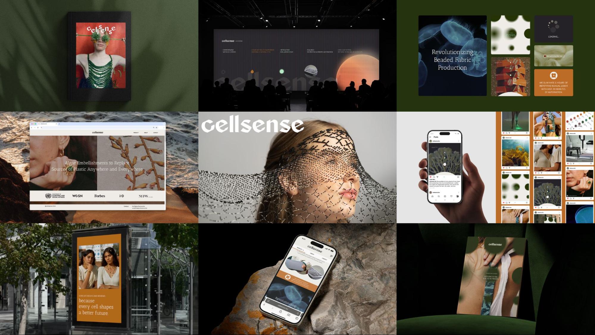
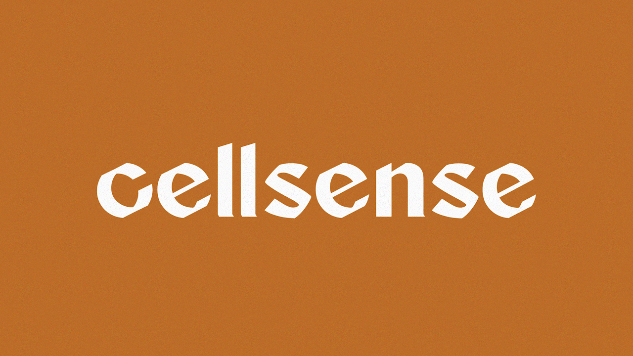
The resulting identity features hand-drawn calligraphy for a human touch and modular forms derived from cellulose—designed to dissolve over time in reflection of the material's biodegradability. A kinetic logo anchors the visual system within a flexible identity. As the brand also considers how natural materials feel and interact, the palette draws from coastal and organic decay—earthy beige, soft algae green, scorched clay, dried coral, and crimson kelp—paired with typography that breathes rather than dominates.
As a B2B brand, Cellsense sees itself as a collaborator within more ethical production networks—supporting practices grounded in ecological awareness and collective responsibility. With its first line of biotech-infused cosmetics on the horizon, the brand frames itself not as a product, but as a proposition. "We're proposing new desires," Jun says. "And to do that, the visual language has to feel alive, not just responsible."
As the line between design and matter continues to blur, Cellsense points to a future where visual language plays an active role in shaping how materials—and their ethics—are understood. It asks what a brand can do when it begins with care, and builds from there.
Watch how the identity behaves across media in the Cellsense brand reel below: