2025-08-21
Lauren Rodriguez
Design Dispatch, New York

In today’s global design landscape, the most impactful work doesn’t just span formats—it bridges cultures, platforms, and emotional contexts. That’s where designer Dahee Choi has quietly built her practice: at the intersection of strategy, system, and storytelling.
With a transnational career spanning Seoul and New York, Choi is part of a rising generation of designers redefining the role of graphic design—moving it from aesthetic garnish to strategic infrastructure. Her practice sits at the intersection of visual systems, brand storytelling, and cultural fluency. In this conversation with Design Dispatch, Choi shares why intentionality guides her work, how emotional clarity shapes her systems, and what’s next as she plans to return to the U.S. to scale her impact.
Your portfolio spans everything from immersive brand tours to ecommerce systems to technical manuals. What ties all of this together for you?
I always start with one question: What kind of experience is this design enabling? Whether it’s a digital product page, a street-level activation, or a printed catalogue, I look for the emotional access point—then I build a system around it.
To me, design is translation. You’re translating complexity into clarity, strategy into feeling, and abstract identity into something tangible. That’s true whether your audience is a skincare shopper or someone buying BMW brake pads for the first time.
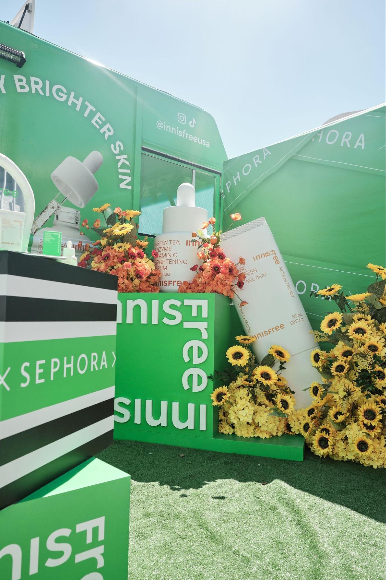
Let’s talk about the Innisfree “Every Day Brighter Skin Tour.” What made that project particularly meaningful?
It was one of the most rewarding projects I’ve worked on—not just because of the scale, but because of how clearly I could see the design in action. I led all of the visual systems for the campaign—from the truck wrap and on-site giveaway materials to localized assets and digital content.
Since I wasn’t able to attend the events in person, my team shared photos and videos from the tour stops. Watching people interact with the visuals—posing for photos, scanning signage, posting on social media—was a rare and meaningful experience. It’s not often you get to see a full brand system come to life like that, across so many real-world touchpoints.
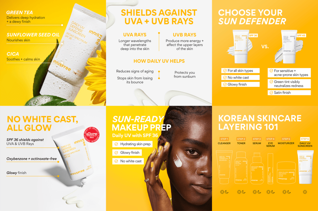
The tour visited ten cities across the U.S. and focused on two hero products: the Green Tea Vitamin C Serum and the Daily UV Defense Sunscreen. We saw a lift across several touchpoints: $43,000 in direct on-site sales, nearly $100,000 in attributed Sephora revenue, over one million video views, and earned media value close to $286,000. But beyond the numbers, what made it stand out for me was how the design helped shape the tone of the experience—making it feel approachable, bright, and worth engaging with.
As a designer, you don’t always get to witness your work in motion. This was one of those rare moments where the feedback loop was immediate—and deeply motivating.
Was there a specific moment that stood out for you during the tour?
Absolutely. My team shared videos from the tour, and in one clip, I saw people gathered around the truck—taking photos, asking about the products, tagging us online. That moment stayed with me. It was clear the visuals weren’t just decorative—they were setting the tone. The brand felt approachable, warm, and worth engaging with.
Design has the power to shape someone’s experience—even just for a few seconds. That’s one of the most fulfilling parts of the work. It’s not only about trends or aesthetics—it’s about making someone feel something: curiosity, delight, trust. And that happens through thoughtful, user-first design.
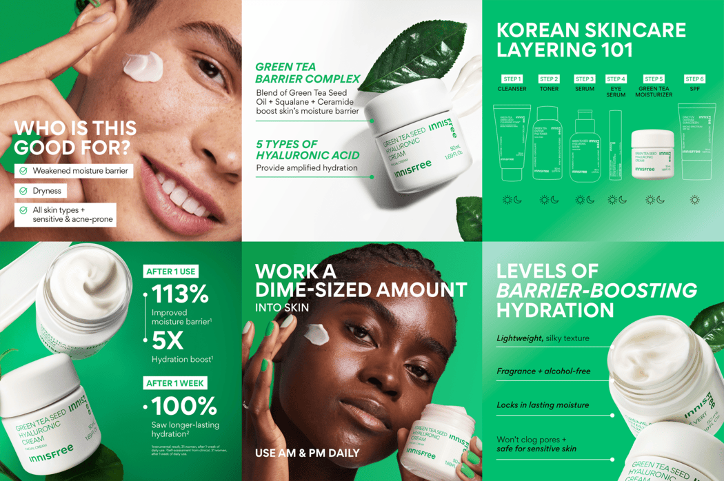
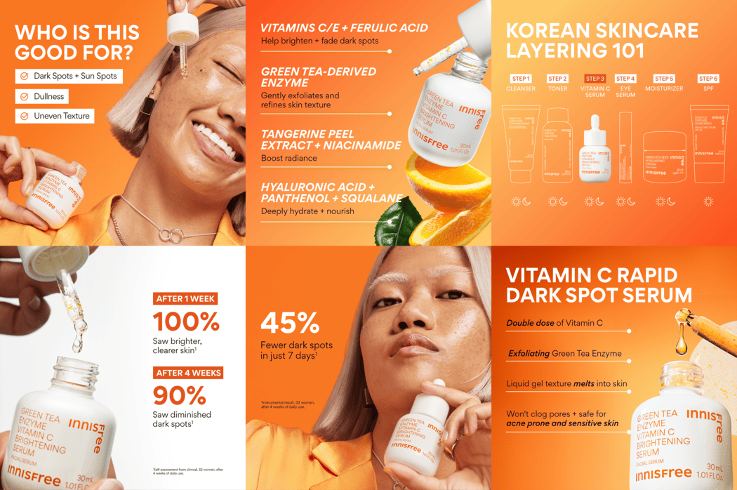
You also designed over 200 product detail pages (PDPs) across platforms like Sephora, Amazon, and Innisfree.com. That sounds deeply technical. How did you approach it creatively?
It was definitely structured—but still creative. Each platform had different requirements, so the challenge was creating a unified visual system that was both effective and adaptable. I built a modular design system with clear spacing rules, consistent type hierarchies, and franchise-specific color palettes.
The goal was to maximize clarity and reduce friction—helping users absorb information faster. And it worked. We saw a 15% increase in traffic and a 5% rise in conversion, all without paid media or discounting.
“It’s about letting design do the heavy lifting. Good design reduces confusion. Great design guides decisions.”
Switching gears—tell us about the BMW project. That’s quite a departure from beauty.
Definitely. I designed a printed BMW parts catalogue intended for general consumers—not engineers or mechanics. The challenge was to translate technical content into something that felt clear and approachable for everyday drivers.
I worked closely with both engineering and marketing teams to ensure accuracy while keeping the design visually digestible. Along with detailed vector illustrations of car parts and diagrams showing their physical locations in the vehicle, the catalog also included a chart explaining when and how often each part should be checked, the specific functions of each component, and the benefits of using BMW original parts.
It was like designing a visual dictionary—precise enough to be informative, but accessible enough to empower someone who may never have looked under the hood before.
Over 1,000 catalogues were printed and distributed across BMW dealerships in Korea. The goal was to build trust through visuals—when people understand what they’re seeing, they’re more likely to engage, ask questions, and eventually make a purchase.
.jpg?alt=media&token=937b3f7e-ba71-430f-bd22-9490995e682d)
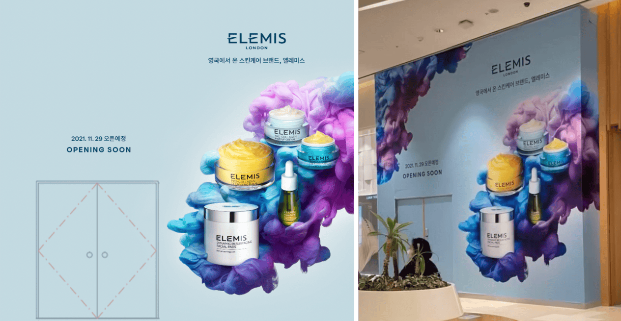
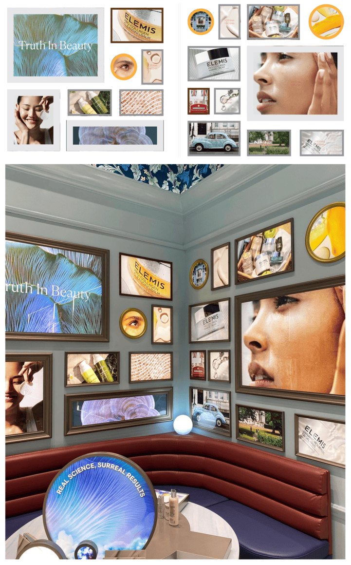
And then there’s your ELEMIS store project in Korea. How did you approach translating a British brand for a Korean audience?
For me, it started with understanding how the brand’s heritage could be communicated in a way that felt meaningful to local consumers. ELEMIS has a strong British identity, but rather than simply importing that aesthetic, I focused on interpreting its core values—quality, calm, and luxury—through a local lens.
We referenced familiar British visuals, like the red telephone booth, but used them sparingly, alongside curated photography and clean layouts that resonated with Korean preferences for refined minimalism. I designed a “Coming Soon” wall graphic, a photo installation, and in-store elements that balanced storytelling with brand clarity.
The goal wasn’t just localization—it was creating a space that felt emotionally aligned with Korean shoppers while staying true to the brand’s DNA.
When do you feel most inspired or fulfilled by your work?
When I get to see people interact with what I’ve created—whether it’s in a store, on social media, or through shared photos and videos. Watching where someone pauses, what they touch, or how they respond helps me understand what’s working and where there’s room to improve.
Those moments feel incredibly grounding. It’s when the intent behind the design meets real-world experience—and that connection is what keeps me going.
You’ve worked across Korea and the U.S. How has that dual-cultural experience influenced your design approach?
It’s given me a deep sensitivity to how different audiences read tone, space, and visual cues. Growing up between the two cultures taught me that what feels premium or trustworthy in one market might not resonate in another. I’m constantly navigating those differences in my design practice.
One clear example is in skincare packaging. In the U.S., brands like Drunk Elephant and Glow Recipe thrive with bold, saturated colors—almost neon at times. These designs cater to younger consumers and prioritize high-impact visuals that stand out on social platforms. A Nielsen study even showed that 64% of U.S. consumers are more likely to try a product if the packaging is visually appealing—especially Gen Z and Millennials.
In contrast, Korean skincare brands like Hanyul and Skin1004 take a much more minimalist approach—soft neutrals, clean typography, and understated forms. It reflects a cultural emphasis on purity, functionality, and calm. According to Mintel, over 70% of South Korean skincare users prefer ‘clean-looking’ packaging that focuses on ingredients and efficacy rather than bold visual cues. That aligns closely with the ‘skin-first’ philosophy that defines K-beauty.
I think of my role as a kind of translator—taking brand values and making sure they show up in a way that feels emotionally true to the audience. As Korean culture becomes more globally visible—through K-pop, beauty, film—I’m proud to contribute to how it’s understood and appreciated across markets.
Where do you see the next chapter of your design career unfolding—and why?
What draws me most is the cultural diversity in cities like New York. It’s a place where so many different perspectives, ideas, and aesthetics collide—and that kind of environment fuels my creativity in a way that a more homogenous culture can’t.
Being surrounded by that constant mix of voices and visual languages keeps me evolving as a designer. It reminds me that good design isn’t static—it adapts, it listens, and it reflects the world around it.
My aim is to help Asian brands expand meaningfully in the West by translating their values and identities into experiences that resonate with emotional clarity. Design is the bridge—and I want to help build it.
Last question: What do you love most about being a graphic designer?
Impact. Good design makes life easier, clearer, and sometimes even more beautiful. When someone scrolls through a product page or pauses to take in a store display I helped create—that invisible moment of connection is what drives me.
Since 2020, I’ve been working remotely from Korea for U.S.-based companies, which has taught me how to design across time zones, cultures, and markets. But I’m excited to take the next step: to be there in person—to join photoshoots, attend design conferences, see how customers respond in real time, and collaborate face-to-face with creative teams.
Eventually, I want to bring those experiences back to Korea and apply what I’ve learned to help brands grow globally—with even more intention and empathy.
That’s why I do this work. That’s what keeps me going.