2025-12-29
Eric Calloway
Design Dispatch, New York
As Los Angeles prepares to host the 2028 Olympic Games, the challenge of translating the city’s cultural energy, architectural identity, and global significance into a cohesive broadcast brand comes into focus. LA 2028 is a conceptual branding project developed as a proposed identity system for NBC’s Olympic coverage, exploring how Los Angeles could be visually represented across broadcast and promotional touchpoints.
Developed as a comprehensive design study, the project envisions how a unified identity could translate across logos, typography, infographics, promotional graphics, and off-air materials, balancing clarity, flexibility, and consistency across broadcast applications. The concept reflects both the athletic spirit of the Olympics and the distinctive character of Los Angeles, demonstrating how a broadcast branding system can integrate cultural expression with functional cohesion.
LA 2028 was conceived as a full-scale branding ecosystem. The project includes a primary logo, typeface selection and typographic framework, a comprehensive style guide, NBC Sports promotional graphics, infographics, and off-air materials, all built around a shared shape language and visual logic.
This approach reflects the realities of modern Olympic broadcast branding, where identities must remain cohesive across multiple platforms while supporting different content needs. Each component was designed to function independently while reinforcing the broader visual system. This principle guided how the identity was structured from the outset.
“An Olympic identity isn’t just a logo,” notes Jason Heo. “It is a system that adapts across countless contexts, from broadcast graphics to wayfinding and promotional storytelling, carrying its color, shapes, and character throughout.”
At the heart of the project is a deep engagement with Los Angeles itself. The design direction draws from the city’s architectural landscape, particularly its embrace of Postmodern forms and experimental structures. Across the city, buildings often prioritize expressive geometry over strict uniformity. This sensibility is reflected throughout the project’s shape language.
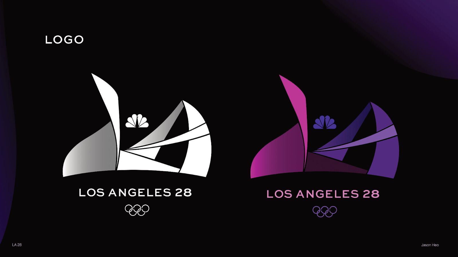
The logo’s core form originated from shapes borrowed from the Oscars’ stage set, referencing Hollywood’s influence and Los Angeles’ role as a global cultural capital. These shapes were abstracted and simplified into a form that feels iconic through the harmony of curved and straight lines, allowing the identity to remain flexible, sleek, and consistent across applications.
The visual language is informed by the physicality of Olympic athletes. Angular curves and folded forms reference balance, tension, and athletic presence, capturing sport as both competition and performance through structure and form.
One of the project’s defining features is the logo’s paper-folded appearance. Instead of appearing flat, the mark suggests depth and construction, as if assembled from layered planes. This dimensional quality reinforces ideas of structure and transformation, aligning with both the evolving identity of Los Angeles and the multifaceted nature of the Olympic Games.
The folded aesthetic introduces a sense of playfulness while maintaining a contemporary and confident tone. It avoids overly literal symbolism and favors a tactile visual language that feels modern, expressive, and adaptable.
“The goal was to create something bold and agile,” Heo explains. “The folds add depth and dimension while keeping the system approachable.”
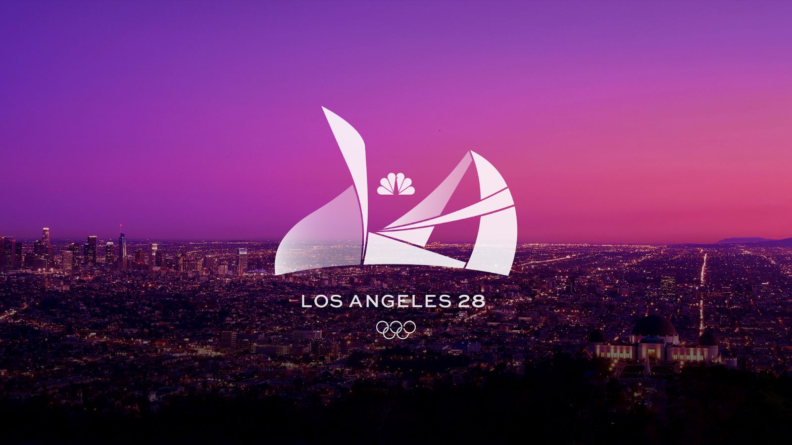
Color plays a central role in defining the emotional tone of LA 2028. The palette draws from Los Angeles’ environment, including expansive skies, vivid sunsets, and illuminated city nights. These references are translated into smooth, harmonious gradients designed to function consistently across branding materials.
Color functions as an atmospheric element within the system. The gradient palette is informed by Los Angeles sky tones, blending night sky hues with the glow of city lights to introduce depth and energy. These gradients reinforce a sense of harmony while supporting bold, high-impact broadcast visuals.
Typography was selected to complement the logo’s geometry and dimensional qualities. Sweet Sans Pro Medium and Bold serve as the primary typefaces, chosen for their wide proportions and balanced combination of curved and straight forms.
The typographic framework establishes clear hierarchy, spacing, and usage rules across applications, ensuring visual cohesion from broadcast graphics to promotional posters and infographics. Typography acts as a structural element within the system, ensuring clarity, legibility, and visual consistency across all applications.
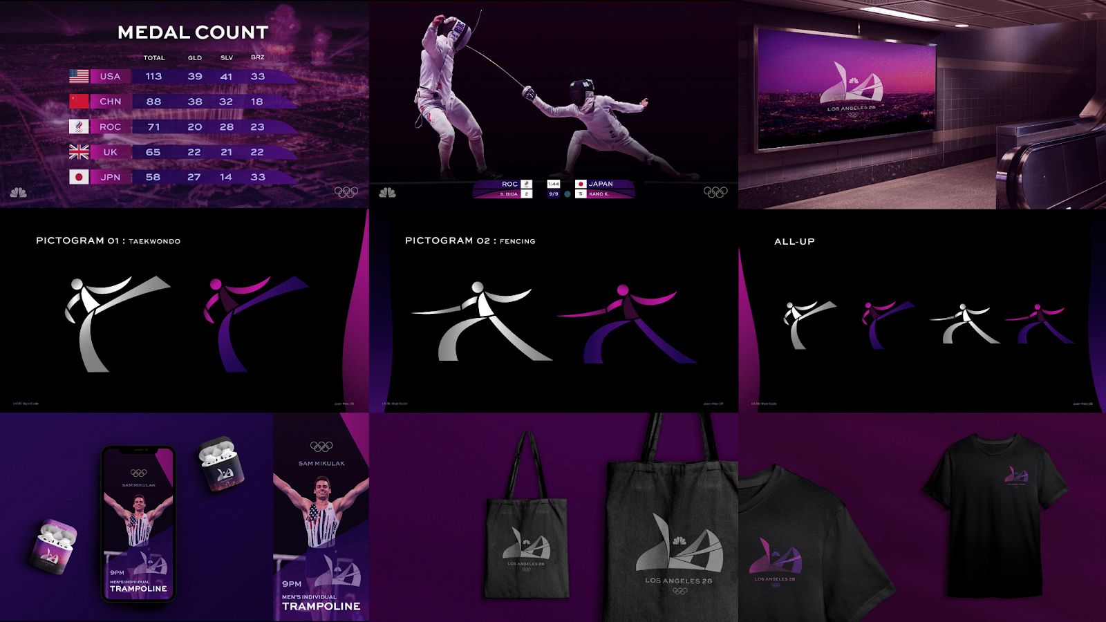
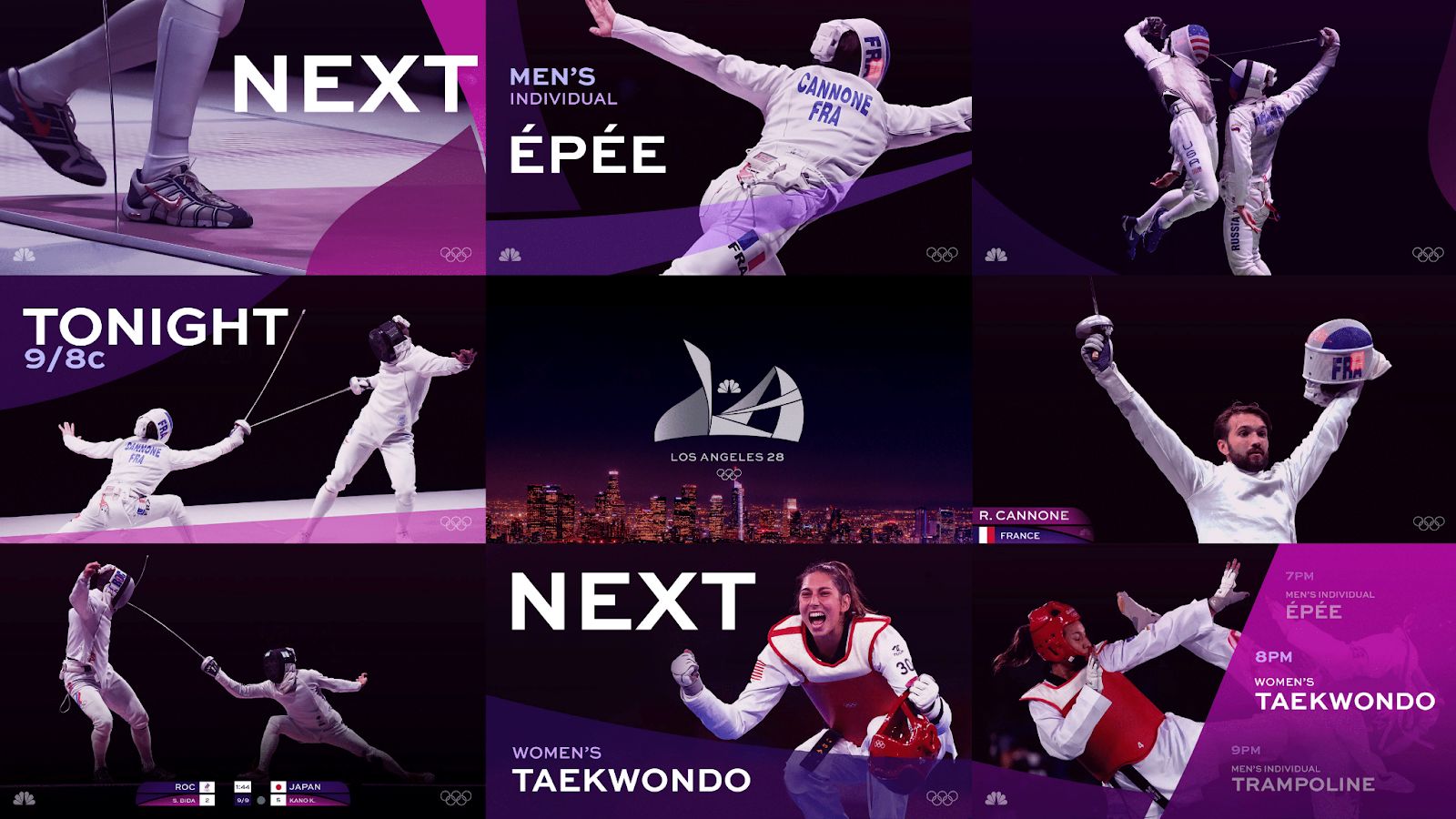
The conceptual system extends into proposed NBC Sports broadcast graphics and promotional materials, illustrating how the identity could operate across real-world media environments. Layered compositions, modular layouts, and a consistent shape language support visual continuity throughout coverage.
Infographics were designed to address core broadcast needs such as medal counts and sport identification, including pictograms for events like taekwondo and fencing. These elements apply the same geometric logic, color system, and typographic hierarchy used throughout the identity, ensuring clarity while maintaining visual cohesion.
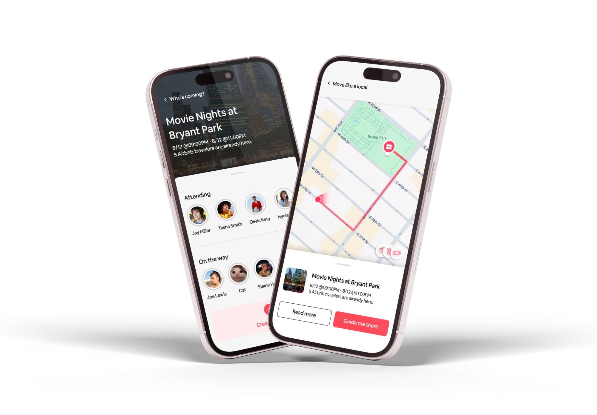
Off-air applications further test the system’s adaptability across digital and physical touchpoints. Concepts include a sample mobile screen, environmental graphics such as billboards, and branded materials like apparel and totes, demonstrating how the identity could extend beyond broadcast while remaining recognizably unified.
LA 2028 was shortlisted for Design Dispatch’s Future Forward Summer 2025, a curated selection recognizing forward-looking design concepts with strong cultural relevance and professional-level execution. This recognition positions the project within a broader conversation about the future of large-scale broadcast branding and identity design.
LA 2028 explores how NBC’s Olympic coverage could visually reflect place, culture, and athletic spirit. More than a background setting, Los Angeles operates as an active influence, with its architecture, atmosphere, and creative energy embedded directly into the branding system.
By combining architectural inspiration, structured typography, and atmospheric color, the project proposes a broadcast identity that feels contemporary, cohesive, and unmistakably local. As global sporting events continue to demand stronger narrative and cultural specificity, projects like LA 2028 highlight the evolving role of branding as an essential framework for storytelling.