Design DispatchDesign Dispatch
  • All articles
  • Fine Arts
  • Brand Identity
  • Graphic Design
  • Fashion
  • About
  • Media pack
  • Terms and conditions
Design DispatchDesign Dispatch

Categories

Fine ArtsBrand IdentityGraphic DesignFashionMusic

Editorial team

Michael ReyesDaniel HartmanEric CallowaySarah ChenEmma FitzgeraldLauren Rodriguez

Company

AboutTerms and conditionsPrivacy policy

© 2026 Design Dispatch

Privacy policyTerms and conditionsCookie policy

Designing Experience Through Brand

2026-01-08

Eric Calloway

Design Dispatch, New York
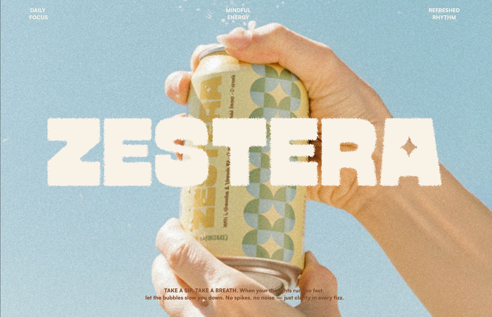
How Zestera Became a Starting Point for a Broader Design Practice

This designer’s work is not easily confined to a single discipline. Heeyeon Lee works across branding and UI/UX, approaching design as a process of structuring how something is encountered, understood, and used. While first recognized through branding projects, her practice increasingly sits at the intersection of visual design and user experience.

This approach became particularly visible through Zestera, a wellness beverage brand project that received recognition from Design Dispatch Future Forward Design Award and Brand of the day– Awarded by Braaands™. While the project brought wider attention, Heeyeon describes it less as a defining achievement and more as a clear example of how she think through design problems.

Zestera: Defining Experience Before Visual Identity

Zestera did not begin as an exercise in creating a new energy drink brand aesthetic. Instead, it started with a broader question: how is “energy” currently perceived and consumed in everyday life, and what kinds of expectations do people bring to it?

Rather than leading with product features or messaging, Heeyeon focused first on context. When does someone encounter this brand? In what physical or emotional state? What kind of interaction feels appropriate in that moment? Only after these questions were addressed did visual elements and systems begin to take shape.

As a result, Zestera functions less as a collection of visual assets and more as a cohesive experience. Its recognition stemmed not only from visual execution, but from the consistency with which experience, tone, and structure were aligned across the brand.
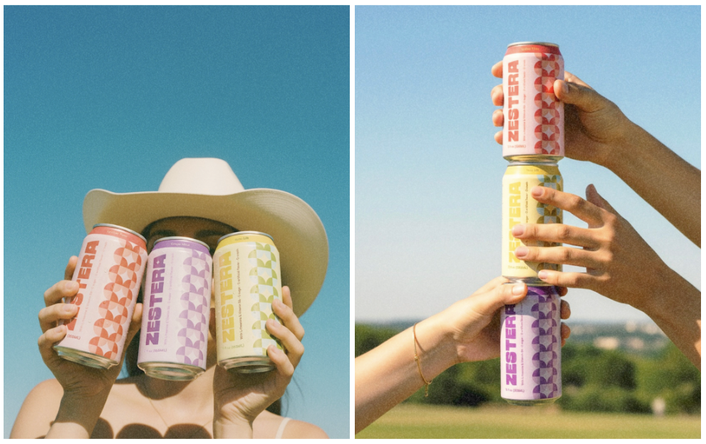
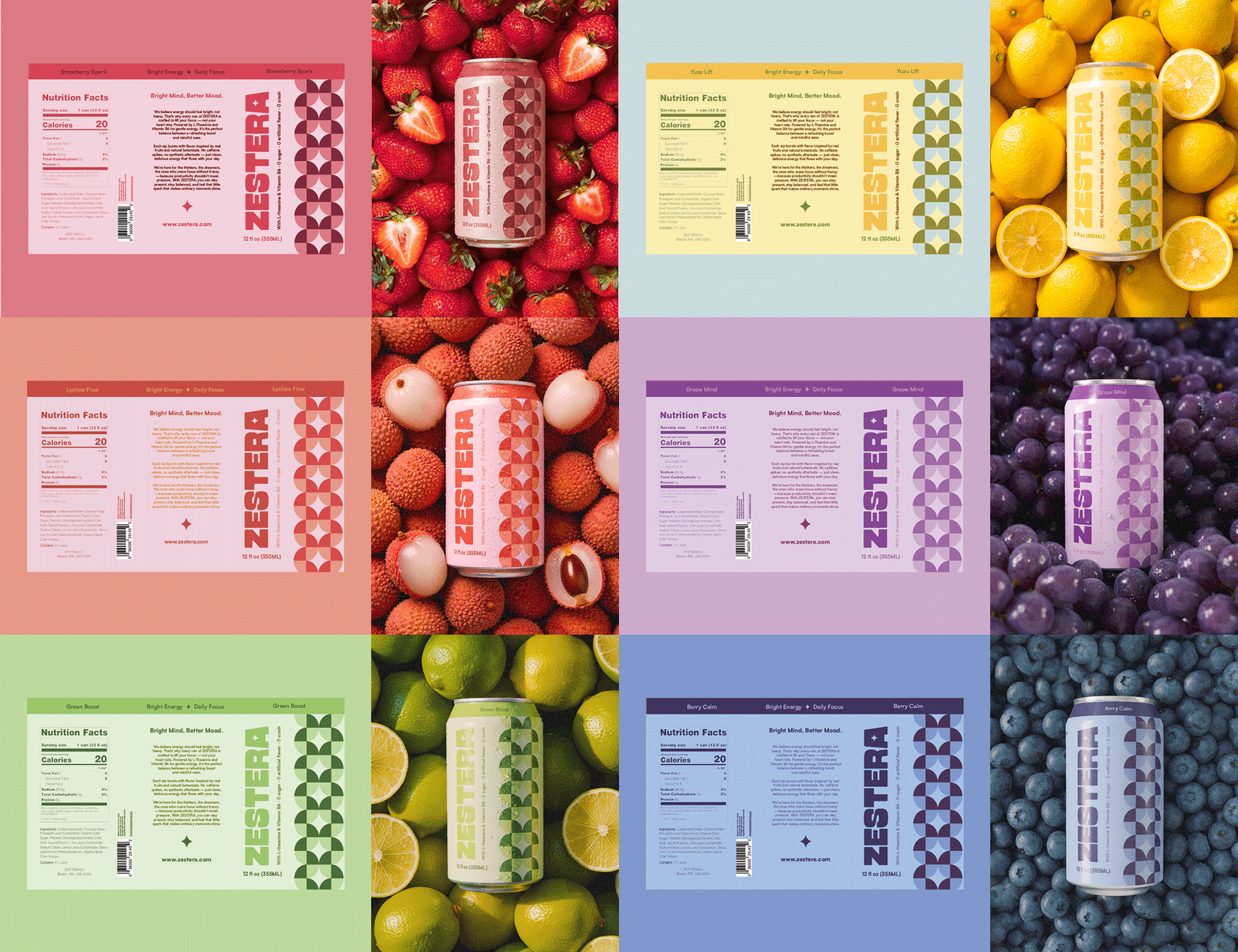
Image ID: kix.c4148f3m8x6 Image ID: kix.ucqv2j5mfuyr

Image ID: kix.pne0qq43maau

From Branding to UI/UX, Without a Sharp Divide

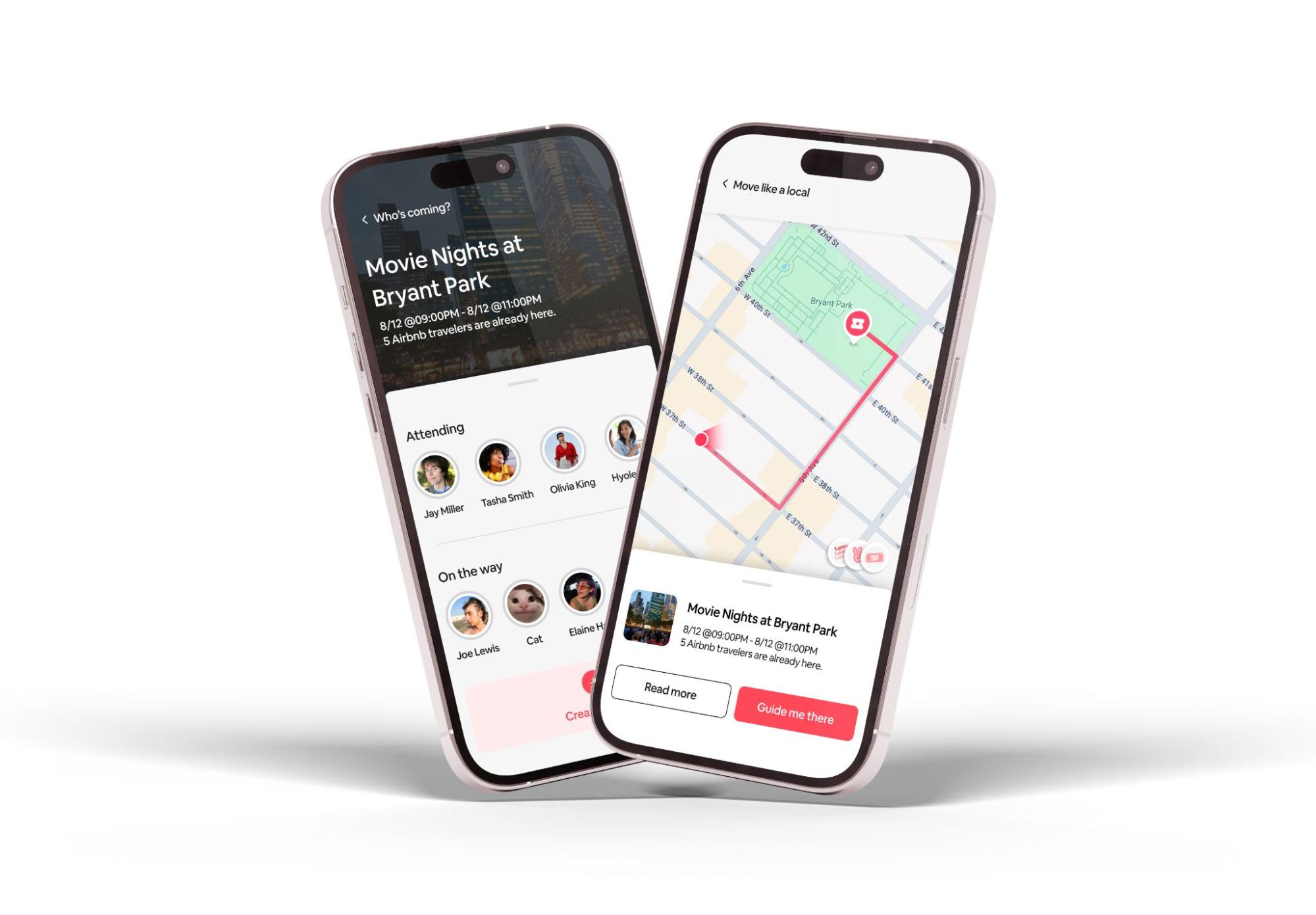
Following Zestera, Heeyeon’s work expanded further into UI/UX design. This shift, however, was not a departure from earlier practice. The same considerations—context, flow, and user behavior—had already been central to her branding work.

In digital products and services, Heeyeon applies similar principles. Screen layouts are informed by how users process information step by step, while brand tone is carried through interaction patterns rather than surface visuals alone. UI design becomes an extension of brand experience, rather than a separate discipline focused purely on usability.
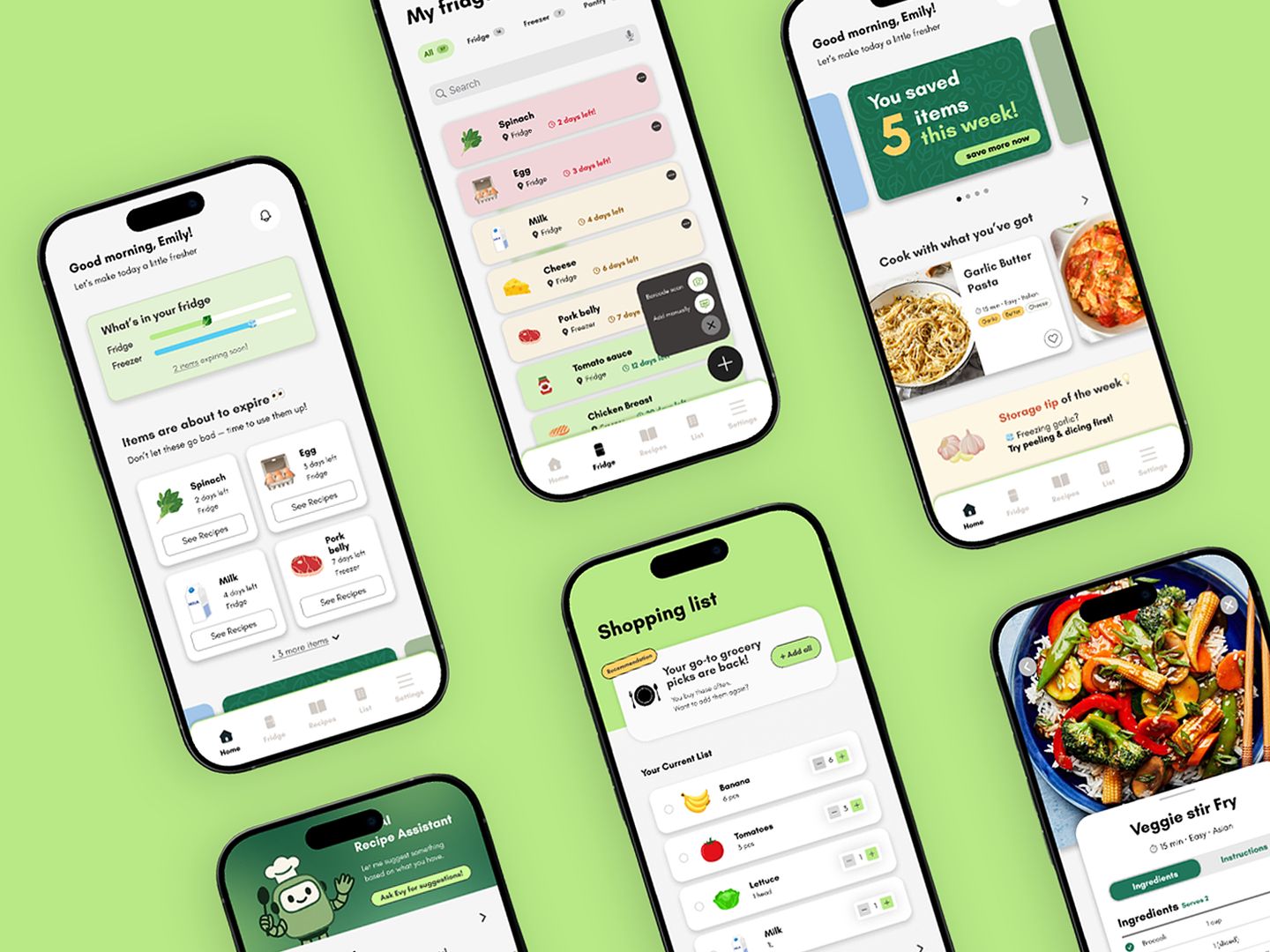
Image ID: kix.i54xdexgjh44

Working Across Disciplines With a Consistent Framework

Across graphic design, branding, and UI/UX, her work follows a consistent set of criteria. Each project begins by identifying the situation the design will enter, the actions it asks of the user, and the order in which information is understood. Rather than instructing users through overt explanation, she focuses on shaping experiences that feel immediately legible.

This approach leads to work that favors clarity over spectacle. Visual decisions are made in service of usability and flow, not attention alone. The systems she designs are intended to function smoothly within everyday contexts, reducing the need for interpretation and allowing understanding to emerge naturally.

Between Brand and Interface

She does not treat branding and UI/UX as separate domains. In her practice, brands are encountered through interfaces, and interfaces actively express brand values through behavior, pacing, and interaction. This perspective positions her work beyond a single output or discipline, emphasizing experience as an integrated whole.

As her practice continues to evolve, this approach extends across a wider range of projects and formats. What remains consistent is her focus on how design operates in real situations: quietly, practically, and with close attention to how people actually live with and use what is created.

More Similar Articles

thumbnail for article titled The Young Jerks tap into the raw aesthetic of commercial art's darker side in their branding.

The Young Jerks tap into the raw aesthetic of commercial art's darker side in their branding.

The Young Jerks' packaging and branding design pay homage to the grittier side of commercial art, evoking a sense of raw energy and rebellion. By embracing unconventional aesthetics, the band's visual identity sets itself apart from mainstream expectations, capturing their unique sonic spirit.

Recently published

More like this

thumbnail for article titled Threads branding origins revealed by internal designers.

Threads branding origins revealed by internal designers.

The Threads design team drew inspiration from Twitter's existing branding while introducing a fresh aesthetic to match the new app's identity. By incorporating subtle visual updates and familiar elements, the team successfully created a distinct look that still resonates with users who were already invested in Twitter.

thumbnail for article titled Plant Heritage Revealed at Historic Garden Estate in England

Plant Heritage Revealed at Historic Garden Estate in England

Borde Hill Country Garden in West Sussex has unveiled its new identity, focusing on the beauty of nature and the unique character of its surroundings. The redesign features an understated yet striking aesthetic, with carefully curated plant species taking center stage.

thumbnail for article titled First Choice faces disruption by upstart Ragged Edge

First Choice faces disruption by upstart Ragged Edge

First Choice, a well-established British travel agency, has undergone significant changes under the leadership of Ragged Edge. The company's rebranding marks an effort to modernize and expand its offerings in the competitive travel industry.

thumbnail for article titled Five Microscopic Models Underpin New Advertising Agency

Five Microscopic Models Underpin New Advertising Agency

The logos of &Walsh, a new advertising agency, are inspired by microscopic organisms, emphasizing the creative and innovative approach to advertising. The unique designs showcase the brand's ability to observe and understand the complexities of the human psyche in order to develop effective marketing strategies.

thumbnail for article titled Cardiff University Unveils New Brand Identity in Honor of Unique Welsh Letter Combinations

Cardiff University Unveils New Brand Identity in Honor of Unique Welsh Letter Combinations

The University of Cardiff has undergone a major rebranding effort to showcase its unique cultural identity. The university's new branding features an exciting visual representation of the eight traditional Welsh digraphs, paying tribute to Wales' rich linguistic heritage and reinforcing its connection to the country.

thumbnail for article titled Talbott and Arding's Identity Places Emphasis on the Gourmet Side of Graphic Design

Talbott and Arding's Identity Places Emphasis on the Gourmet Side of Graphic Design

A growing trend in branding, Identity for Talbott & Arding showcases a sophisticated and refined approach to graphic design. The result is a visually stunning identity that elevates the company's reputation as a high-end provider of luxury goods.

thumbnail for article titled Tech meets wilderness in latest AI-powered outdoor navigation system

Tech meets wilderness in latest AI-powered outdoor navigation system

The article discusses the integration of technology with outdoor gear, specifically the concept of "gorpcore," which combines functional and technical elements with a focus on comfort and practicality. This fusion is exemplified in an AI-powered compass designed for adventurers who value both navigation and personal style.